10 Graphics
Introduction
Graphics is a great strength of R. The graphics package is part of the
standard distribution and contains many useful functions for creating a
variety of graphic displays. The base functionality has been expanded and made easier with ggplot2, part of the tidyverse of packages. In this chapter we will focus on examples using ggplot2, and we will occasionally suggest other packages. In this chapter’s See Also sections we mention functions in other packages that do the same job in a different way. We suggest that you explore those alternatives if you
are dissatisfied with what’s offered by ggplot2 or base graphics.
Graphics is a vast subject, and we can only scratch the surface here.
Winston Chang’s R Graphics Cookbook, 2nd Edition, is part of the O’Reilly Cookbook series
and walks through many useful recipes with a focus on ggplot2.
If you want to delve deeper, we recommend R Graphics by Paul Murrell
(Chapman & Hall, 2006). R Graphics discusses the paradigms behind R
graphics, explains how to use the graphics functions, and contains
numerous examples—including the code to re-create them. Some of the
examples are pretty amazing.
The Illustrations
The graphs in this chapter are mostly plain and unadorned. We did that
intentionally. When you call the ggplot function, as in:
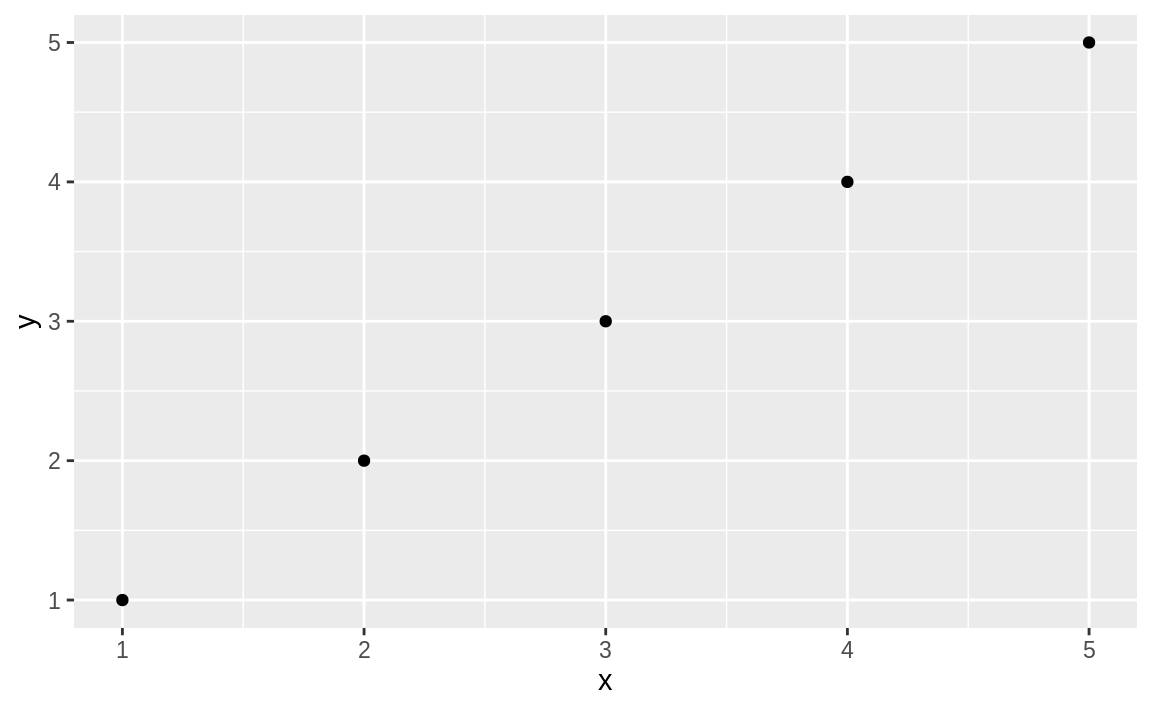
Figure 10.1: Simple plot
you get a plain, graphical representation of x and y as shown in Figure 10.1.
You could adorn the
graph with colors, a title, labels, a legend, text, and so forth, but
then the call to ggplot becomes more and more crowded, obscuring the
basic intention.
ggplot(df, aes(x, y)) +
  geom_point() +
  labs(
    title = "Simple Plot Example",
    subtitle = "with a subtitle",
    x = "x-values",
    y = "y-values"
  ) +
  theme(panel.background = element_rect(fill = "white", colour = "grey50"))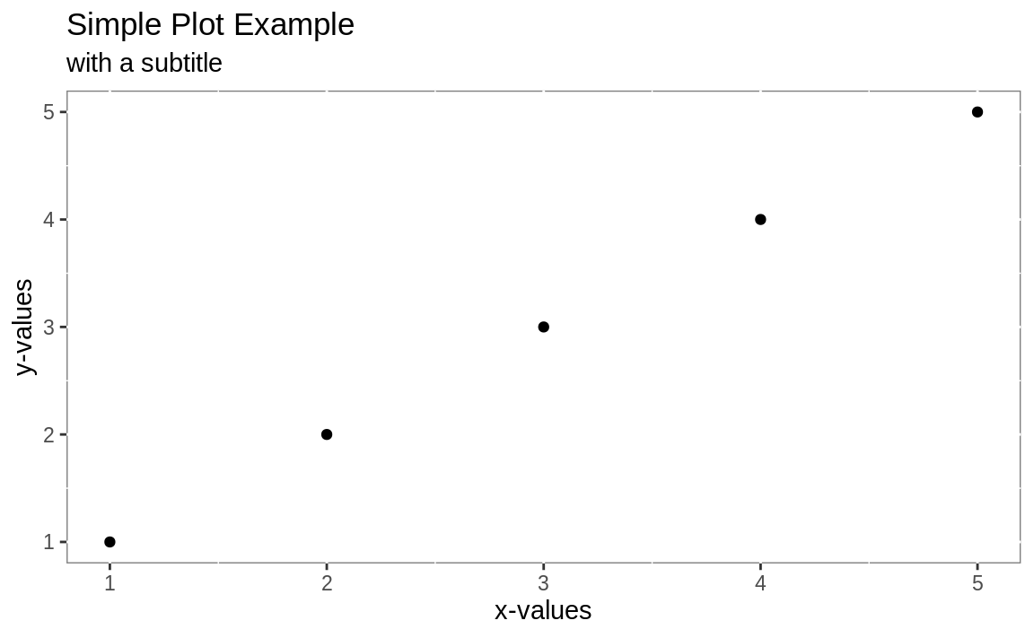
Figure 10.2: Slightly more complicated plot
The resulting plot is shown in Figure 10.2. We want to keep the recipes clean, so we emphasize the basic plot and then show later (as in Recipe 10.2, “Adding a Title and Labels”) how to add adornments.
Notes on ggplot2 basics
While the package is called ggplot2, the primary plotting function in the package is called ggplot. It is important to understand the basic pieces of a ggplot2 graph. In the preceding examples, you can see that we pass data into ggplot, then define how the graph is created by stacking together small phrases that describe some aspect of the plot. This stacking together of phrases is part of the “grammar of graphics” ethos (that’s where the gg comes from).
To learn more, you can read “A Layered Grammar of Graphics” written by ggplot2 author Hadley Wickham.
The “grammar of graphics” concept originated with Leland Wilkinson, who articulated the idea of building graphics up from a set of primitives (i.e., verbs and nouns). With ggplot, the underlying data need not be fundamentally reshaped for each type of graphical representation. In general, the data stays the same and the user then changes syntax slightly to illustrate the data differently. This is significantly more consistent than base graphics, which often require reshaping the data in order to change the way it is visualized.
As we talk about ggplot graphics, it’s worth defining the components of a ggplot graph:
geometric object functionsThese are geometric objects that describe the type of graph being created. These start with
geom_and examples includegeom_line,geom_boxplot, andgeom_point,along with dozens more.aestheticsThe aesthetics, or aesthetic mappings, communicate to
ggplotwhich fields in the source data get mapped to which visual elements in the graphic. This is theaesline in aggplotcall.statsStats are statistical transformations that are done before displaying the data. Not all graphs will have stats, but a few common stats are
stat_ecdf(the empirical cumulative distribution function) andstat_identity, which tellsggplotto pass the data without doing any stats at all.facet functionsFacets are subplots where each small plot represents a subgroup of the data. The faceting functions include
facet_wrapandfacet_grid.themesThemes are the visual elements of the plot that are not tied to data. These might include titles, margins, table of contents locations, or font choices.
layerA layer is a combination of data, aesthetics, a geometric object, a stat, and other options to produce a visual layer in the
ggplotgraphic.
“Long” Versus “Wide” Data with ggplot
One of the first sources of confusion for new ggplot users is that they are inclined to reshape their data to be “wide” before plotting it. “Wide” here means every variable they are plotting is its own column in the underlying data frame. This is an approach that many users develop while using Excel and then bring with them to R. ggplot works most easily with “long” data where additional variables are added as rows in the data frame rather than columns. The great side effect of adding more measurements as rows is that any properly constructed ggplot graphs will automatically update to reflect the new data without changing the ggplot code. If each additional variable were added as a column, then the plotting code would have to be changed to introduce additional variables. This idea of “long” versus “wide” data will become more obvious in the examples in the rest of this chapter.
Graphics in Other Packages
R is highly programmable, and many people have extended its graphics
machinery with additional features. Quite often, packages include
specialized functions for plotting their results and objects. The zoo
package, for example, implements a time series object. If you create a
zoo object z and call plot(z), then the zoo package does the
plotting; it creates a graphic that is customized for displaying a time
series. zoo uses base graphics so the resulting graph will not be a ggplot graphic.
There are even entire packages devoted to extending R with new graphics
paradigms. The lattice package is an alternative to base
graphics that predates ggplot2. It uses a powerful graphics paradigm that enables you to
create informative graphics more easily. It was implemented by Deepayan Sarkar, who also
wrote Lattice: Multivariate Data Visualization with R (Springer, 2008),
which explains the package and how to use it. The lattice package is
also described in R in a Nutshell (O’Reilly).
There are two chapters in Hadley Wickham’s excellent book R for Data Science that deal with graphics. Chapter 7, “Exploratory Data Analysis,” focuses on exploring data with ggplot2, while Chapter 28, “Graphics for Communication,” explores communicating to others with graphics. R for Data Science is available in a printed version from O’Reilly or online.
10.1 Creating a Scatter Plot
Problem
You have paired observations: (x1, y1), (x2, y2), …, (xn, yn). You want to create a scatter plot of the pairs.
Solution
We can plot the data by calling ggplot, passing in the data frame, and invoking a geometric point function:
In this example, the data frame is called df and the x and y data are in fields named x and y, which we pass to the aesthetic in the call aes(x, y).
Discussion
A scatter plot is a common first attack on a new dataset. It’s a quick way to see the relationship, if any, between x and y.
Plotting with ggplot requires telling ggplot what data frame to use, then what type of graph to create, and which aesthetic mapping (aes) to use. The aes in this case defines which field from df goes into which axis on the plot. Then the command geom_point communicates that you want a point graph, as opposed to a line or other type of graphic.
We can use the built-in mtcars dataset to illustrate plotting horsepower (hp) on the x-axis and fuel economy (mpg) on the y-axis:
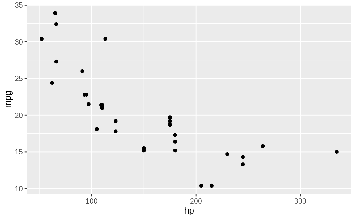
Figure 10.3: Scatter plot example
The resulting plot is shown in Figure 10.3.
See Also
See Recipe 10.2, “Adding a Title and Labels”, for adding a title and labels; see Recipes @ref(recipe-id261,) “Adding a Grid”, and 10.6, “Adding (or Removing) a Legend”, for adding a grid and a legend (respectively). See Recipe 10.8, “Plotting All Variables Against All Other Variables”, for plotting multiple variables.
10.2 Adding a Title and Labels
Problem
You want to add a title to your plot or add labels for the axes.
Solution
With ggplot we add a labs element that controls the labels for the title and axes.
When calling labs in ggplot, specify:
titleThe desired title text
xx-axis label
yy-axis label
Discussion
The graph created in Recipe 10.1, “Creating a Scatter Plot”, is quite plain. A title and better labels will make it more interesting and easier to interpret.
Note that in ggplot you build up the elements of the graph by connecting the parts with the plus sign, +. So we add further graphical elements by stringing together phrases. You can see this in the following code, which uses the built-in mtcars dataset and plots horsepower versus fuel economy in a scatter plot, shown in Figure 10.4
ggplot(mtcars, aes(hp, mpg)) +
geom_point() +
labs(title = "Cars: Horsepower vs. Fuel Economy",
x = "HP",
y = "Economy (miles per gallon)")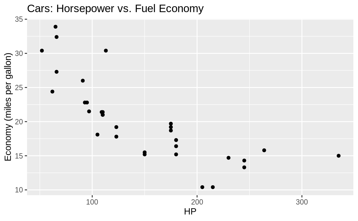
Figure 10.4: Labeled axis and title
10.3 Adding (or Removing) a Grid
Problem
You want to change the background grid to your graphic.
Solution
With ggplot background grids come as a default, as you have seen in other recipes. However, we can alter the background grid using the theme function or by applying a prepackaged theme to our graph.
We can use theme to alter the background panel of our graphic:
ggplot(df) +
  geom_point(aes(x, y)) +
  theme(panel.background = element_rect(fill = "white", colour = "grey50"))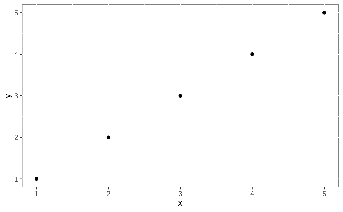
Figure 10.5: White background
Discussion
ggplot fills in the background with a grey grid by default. So you may find yourself wanting to remove that grid completely or change it to something else. Let’s create a ggplot graphic and then incrementally change the background style.
We can add or change aspects of our graphic by creating a ggplot object, then calling the object and using the + to add to it. The background shading in a ggplot graphic is actually three different graph elements:
panel.grid.major:
These are white by default and heavy.
panel.grid.minor:
These are white by default and light.
panel.background:
This is the background that is grey by default.
You can see these elements if you look carefully at the background of Figure 10.4:
If we set the background as element_blank, then the major and minor grids are there, but they are white on white so we can’t see them in Figure 10.6:
g1 <- ggplot(mtcars, aes(hp, mpg)) +
  geom_point() +
  labs(title = "Cars: Horsepower vs. Fuel Economy",
       x = "HP",
       y = "Economy (miles per gallon)") +
  theme(panel.background = element_blank())
g1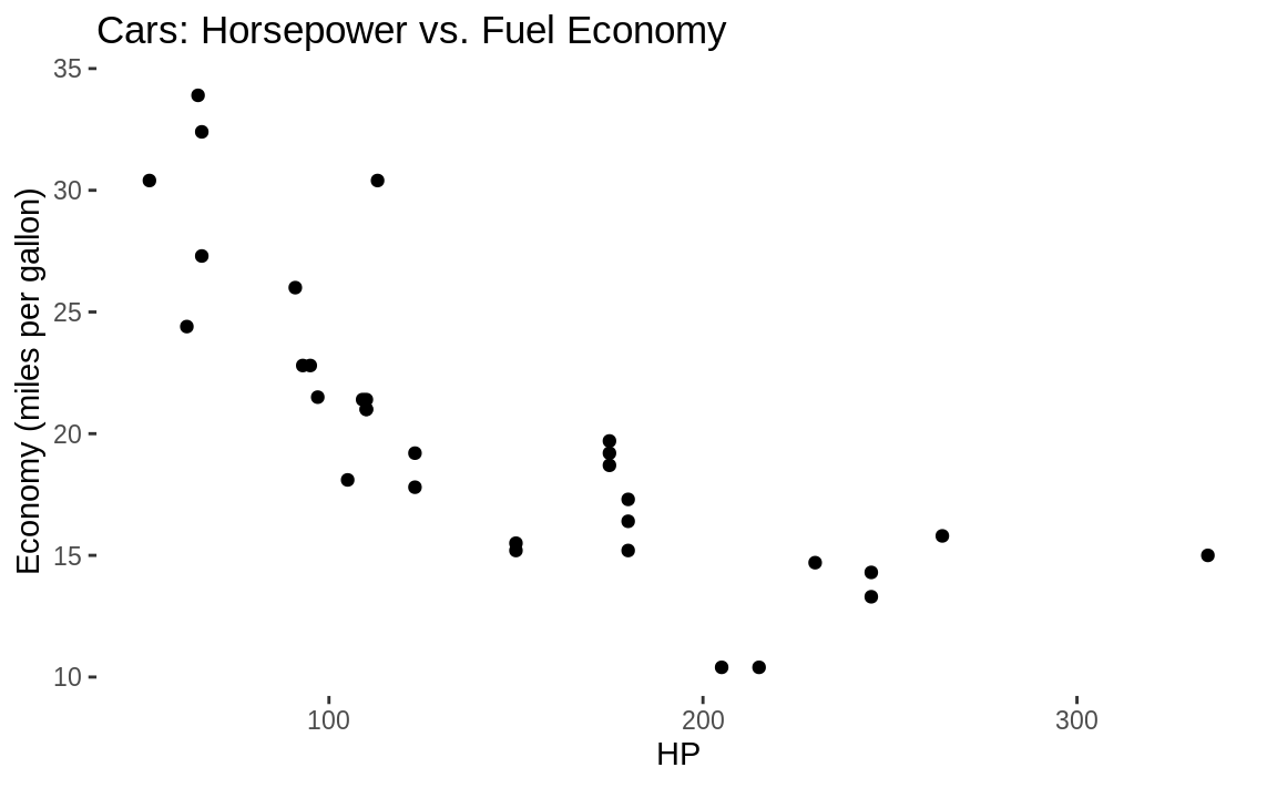
Figure 10.6: Blank background
Notice in the previous code we put the ggplot graph into a variable called g1. Then we printed the graphic by just calling g1. By having the graph inside of g1, we can then add further graphical components without rebuilding the graph.
But if we wanted to show the background grid with unusual patterns for illustration, it’s as easy as setting its components to a color and setting a line type, which is shown in Figure 10.7.
g2 <- g1 + theme(panel.grid.major =
                   element_line(color = "black", linetype = 3)) +
  # linetype = 3 is dash
  theme(panel.grid.minor =
          element_line(color = "darkgrey", linetype = 4))
  # linetype = 4 is dot dash
g2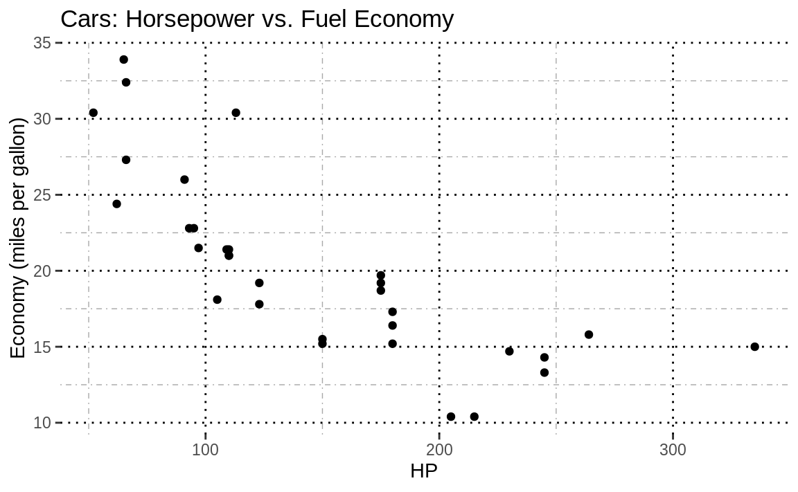
Figure 10.7: Major and minor gridlines
Figure 10.7 lacks visual appeal, but you can clearly see that the doted black lines make up the major grid and the dashed grey lines are the minor grid.
Or we could do something less garish and take the ggplot object g1 from before and add grey gridlines to the white background, shown in Figure 10.8.

Figure 10.8: Grey major gridlines
See Also
See Recipe 10.4, “Applying a Theme to a ggplot Figure”, to see how to apply an entire canned theme to your figure.
10.4 Applying a Theme to a ggplot Figure
Problem
You want your plot to use a preset collection of colors, styles, and formatting.
Solution
ggplot supports themes, which are collections of settings for your figures. To use one of the themes, just add the desired theme function to your ggplot with a +:
The ggplot2 package contains the following themes:
theme_bw()
theme_dark()
theme_classic()
theme_gray()
theme_linedraw()
theme_light()
theme_minimal()
theme_test()
theme_void()
Discussion
Let’s start with a simple plot and then show how it looks with a few of the built-in themes. Figure 10.9 shows a basic ggplot figure with no theme applied.
p <- ggplot(mtcars, aes(x = disp, y = hp)) +
  geom_point() +
  labs(title = "mtcars: Displacement vs. Horsepower",
       x = "Displacement (cubic inches)",
       y = "Horsepower")
p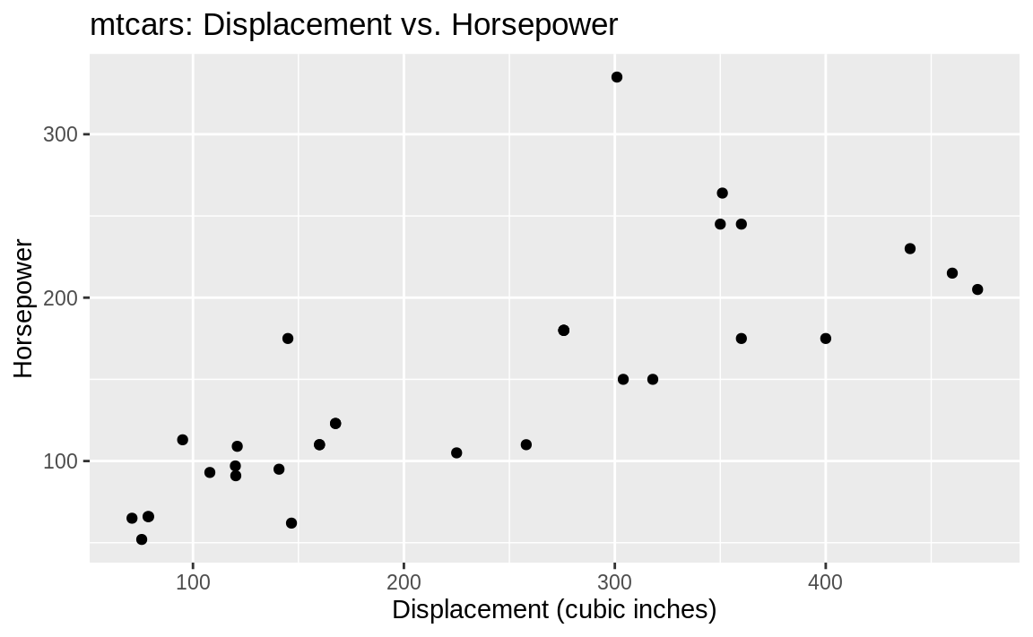
Figure 10.9: Starting plot
Let’s create the same plot multiple times, but apply a different theme to each one:
theme_bw(Figure 10.10):
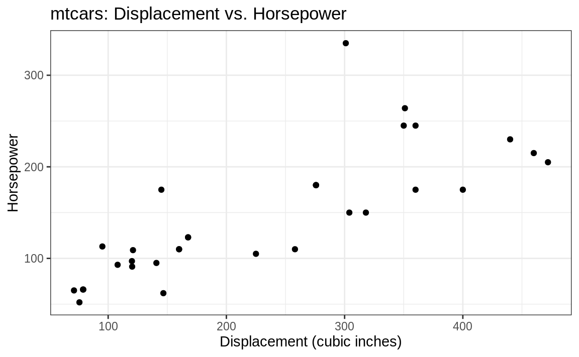
Figure 10.10: (ref:bw)
theme_classic(Figure 10.11):
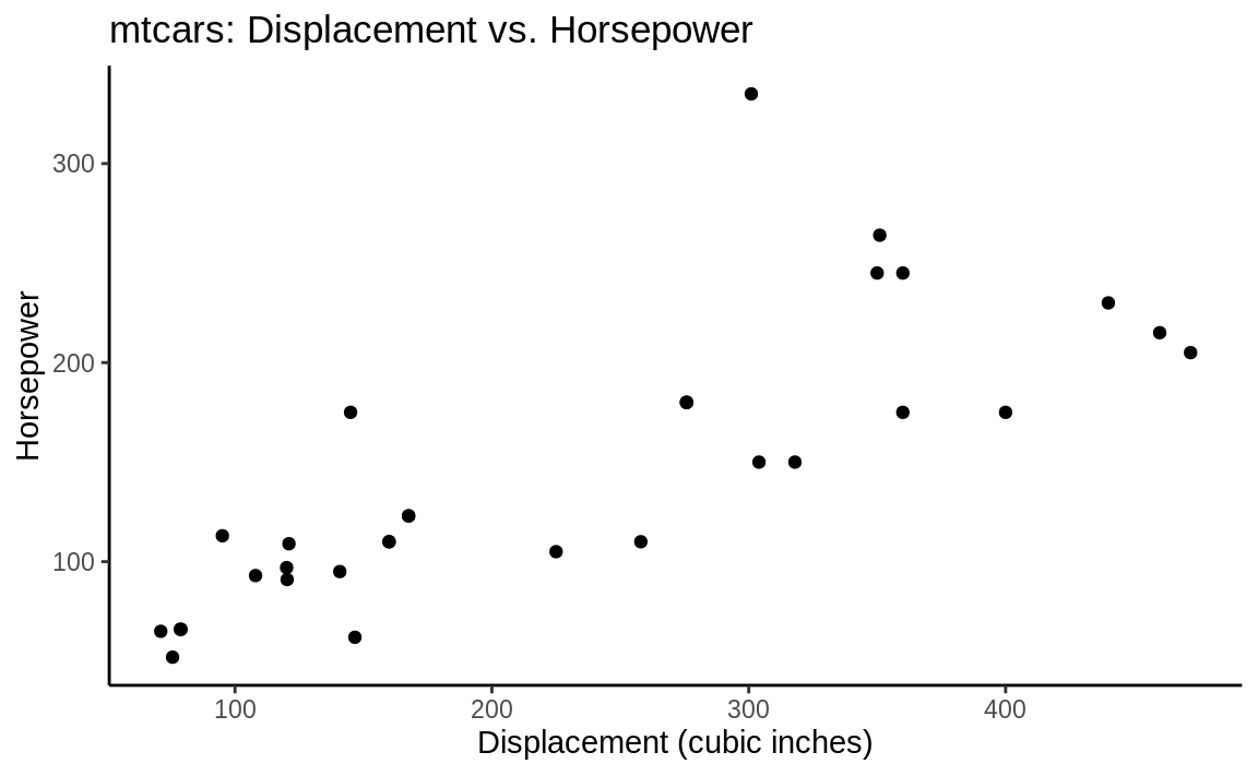
Figure 10.11: (ref:classic)
theme_minimal(Figure 10.12):
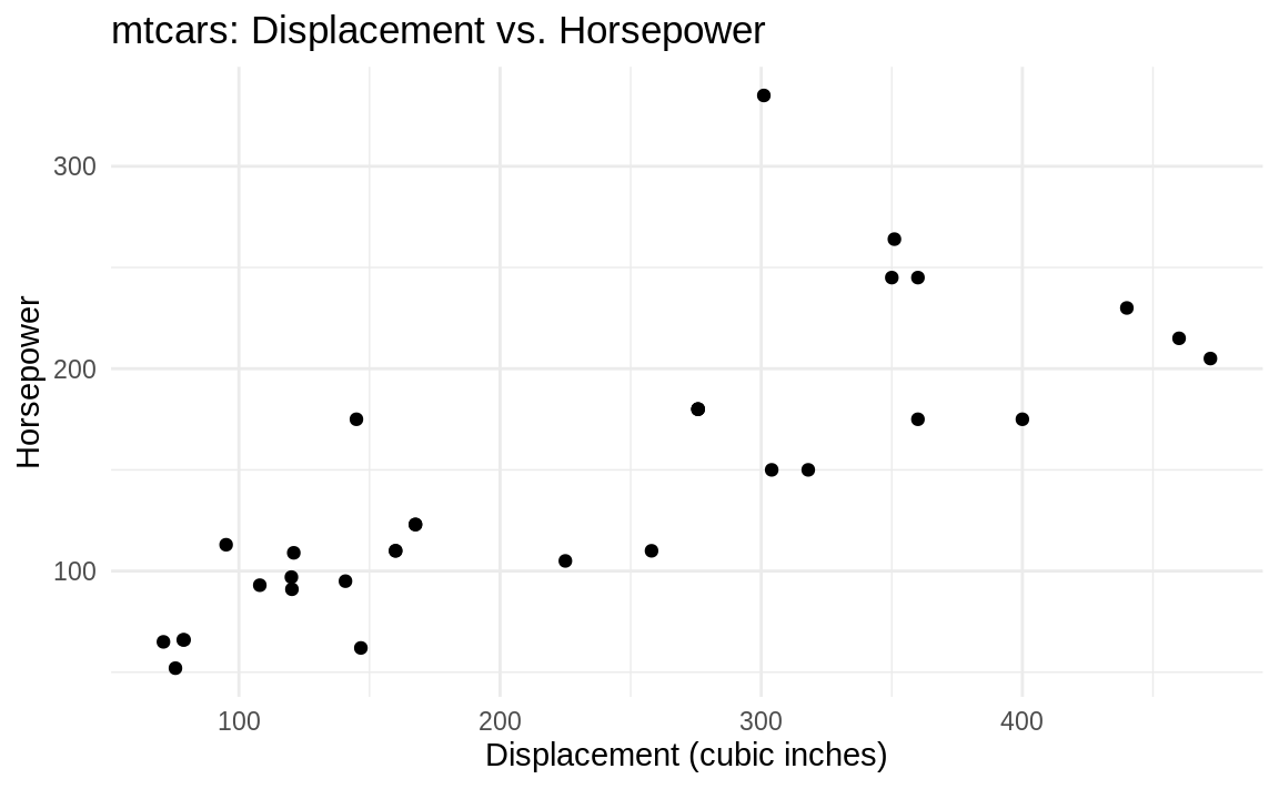
Figure 10.12: (ref:minimal)
theme_void(Figure 10.13):
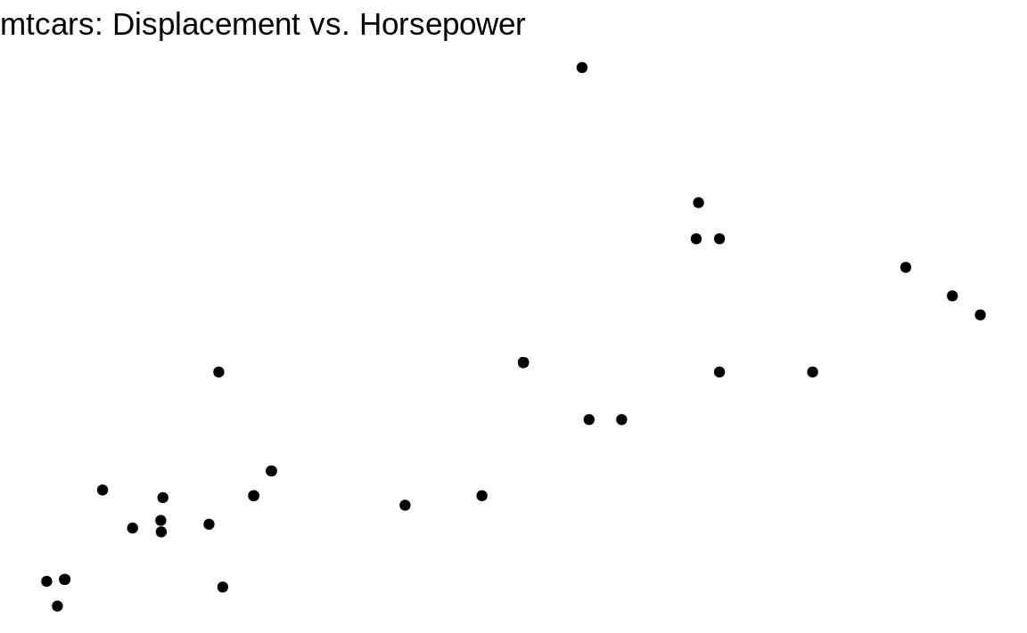
Figure 10.13: (ref:void)
In addition to the themes included in ggplot2, there are packages, like ggtheme, that include themes to help you make your figures look more like the figures found in popular tools and publications such as Stata or The Economist.
See Also
See Recipe 10.3, “Adding (or Removing) a Grid”, to see how to change a single theme element.
10.5 Creating a Scatter Plot of Multiple Groups
Problem
You have data in a data frame with multiple observations per record: x, y, and a factor f that indicates the group. You want to create a scatter plot of x and y that distinguishes among the groups.
Solution
With ggplot we control the mapping of shapes to the factor f by passing shape = f to the aes.
Discussion
Plotting multiple groups in one scatter plot creates an uninformative
mess unless we distinguish one group from another. We make this distinction in ggplot by setting the shape parameter of the aes function.
The built-in iris dataset contains paired measures of Petal.Length and
Petal.Width. Each measurement also has a Species property indicating
the species of the flower that was measured. If we plot all the data at
once, we just get the scatter plot shown in Figure 10.14:
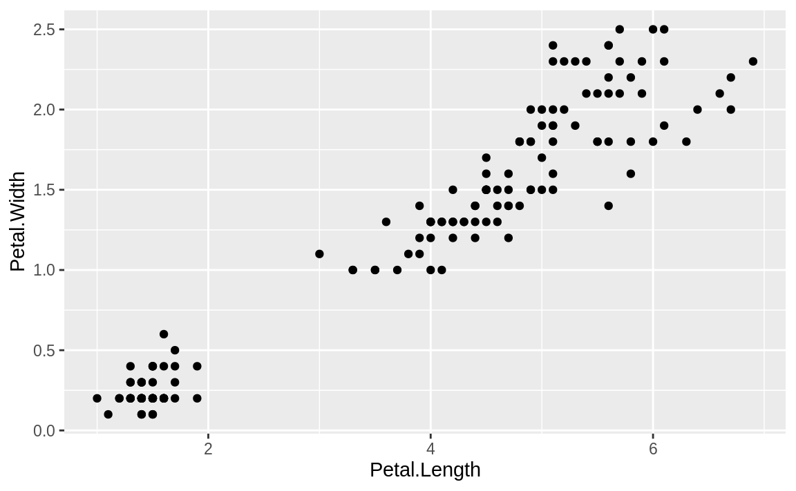
Figure 10.14: iris: length vs. width
The graphic would be far more informative if we distinguished the points
by species. In addition to distinguishing species by shape, we could also differentiate by color. We can add shape = Species and color = Species to our aes call, to get each species with a different shape and color, shown in Figure 10.15.
ggplot(data = iris,
       aes(
         x = Petal.Length,
         y = Petal.Width,
         shape = Species,
         color = Species
       )) +
  geom_point()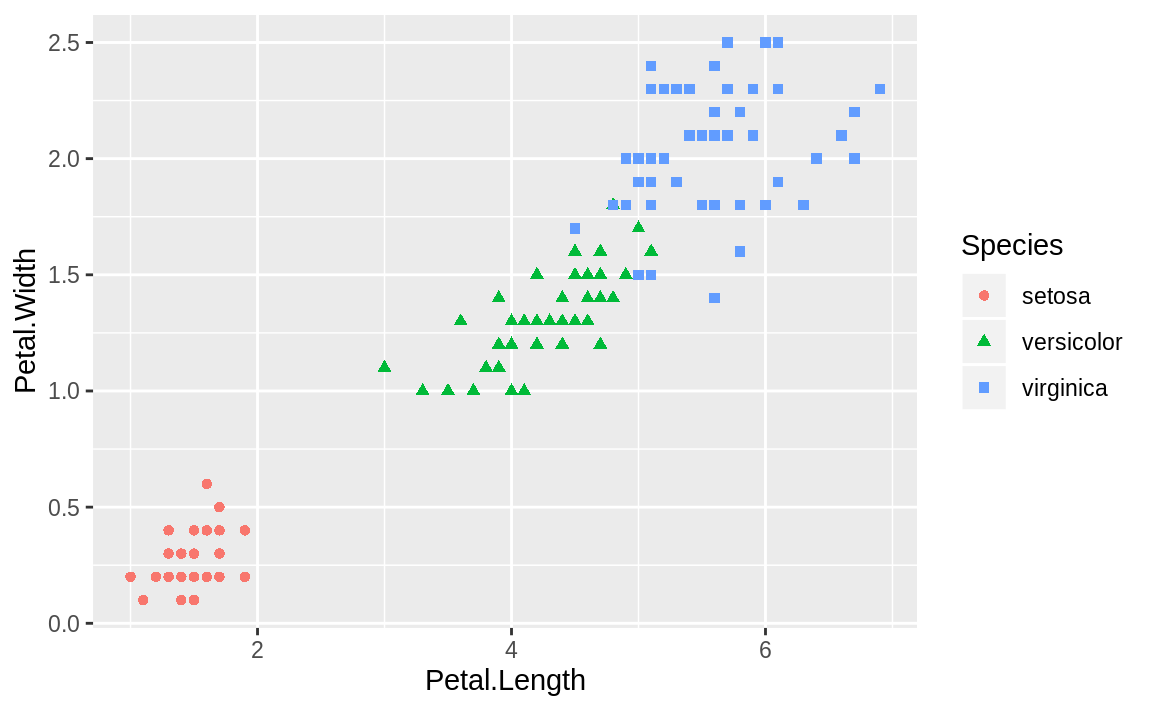
Figure 10.15: iris: shape and color
ggplot conveniently sets up a legend for you as well, which is handy.
See Also
See Recipe 10.6, “Adding (or Removing) a Legend”, for more on how to add a legend.
10.6 Adding (or Removing) a Legend
Problem
You want your plot to include a legend, the little box that decodes the graphic for the viewer.
Solution
In most cases ggplot will add the legends automatically, as you can see in the previous recipe. If you do not have explicit grouping in the aes, then ggplot will not show a legend by default. If we want to force ggplot to show a legend, we can set the shape or line type of our graph to a constant. ggplot will then show a legend with one group. We then use guides to guide ggplot in how to label the legend.
This can be illustrated with our iris scatter plot:
g <- ggplot(data = iris,
       aes(x = Petal.Length,
           y = Petal.Width,
           shape="Observation")) +
  geom_point()  +
  guides(shape=guide_legend(title="My Legend Title"))
g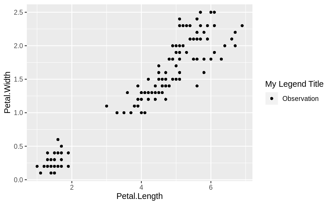
Figure 10.16: Legend added
Figure 10.16 illustrates the result of setting the shape to a string value and then relabeling the legend using guides.
More commonly, you may want to turn legends off, which you can do by setting the legend.position = "none" in the theme. We can use the iris plot from the prior recipe and add the theme call as shown in Figure 10.17:
g <- ggplot(data = iris,
            aes(
              x = Petal.Length,
              y = Petal.Width,
              shape = Species,
              color = Species
            )) +
  geom_point() +
  theme(legend.position = "none")
g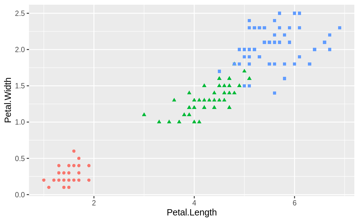
Figure 10.17: Legend removed
Discussion
Adding legends to ggplot when there is no grouping is an exercise in “tricking” ggplot into showing the legend by passing a string to a grouping parameter in aes. While this will not change the grouping (as there is only one group), it will result in a legend being shown with a name.
Then we can use guides to alter the legend title. It’s worth noting that we are not changing anything about the data, just exploiting settings in order to coerce ggplot into showing a legend when it typically would not.
One of the huge benefits of ggplot is its very good defaults. Getting positions and correspondence between labels and their point types is done automatically, but can be overridden if needed. To remove a legend totally, we set theme parameters with theme(legend.position = "none"). In addition to "none" you can set the legend.position to be "left", "right", "bottom", "top", or a two-element numeric vector. Use a two-element numeric vector in order to pass ggplot specific coordinates of where you want the legend. If you’re using the coordinate positions, the values passed are between 0 and 1 for the x and y position, respectively.
Figure 10.18 shows an example of a legend positioned at the bottom, created with this adjustment to the legend.position:
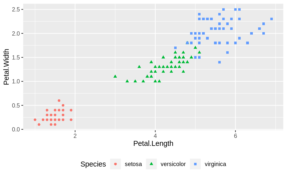
Figure 10.18: Legend on the bottom
Or we could use the two-element numeric vector to put the legend in a specific location, as in Figure 10.19. The example puts the center of the legend at 80% to the right and 20% up from the bottom.
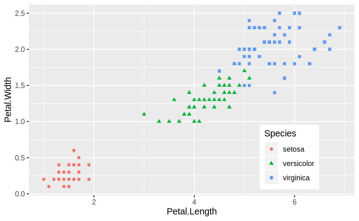
Figure 10.19: Legend at a point
In many aspects beyond legends, ggplot uses sane defaults but offers the flexibility to override them and tweak the details. You can find more details on ggplot options related to legends in the help for theme by typing **?theme** or looking in the ggplot online reference material.
10.7 Plotting the Regression Line of a Scatter Plot
Problem
You are plotting pairs of data points, and you want to add a line that illustrates their linear regression.
Solution
With ggplot there is no need to calculate the linear model first using the R lm function. We can instead use the geom_smooth function to calculate the linear regression inside of our ggplot call.
If our data is in a data frame df and the x and y data are in columns x and y, we plot the regression line like this:
The se = FALSE parameter tells ggplot not to plot the standard error bands around our regression line.
Discussion
Suppose we are modeling the strongx dataset found in the faraway package. We can create a linear model using the built-in lm function in R. We can predict the variable crossx as a linear function of energy. First, let’s look at a simple scatter plot of our data:
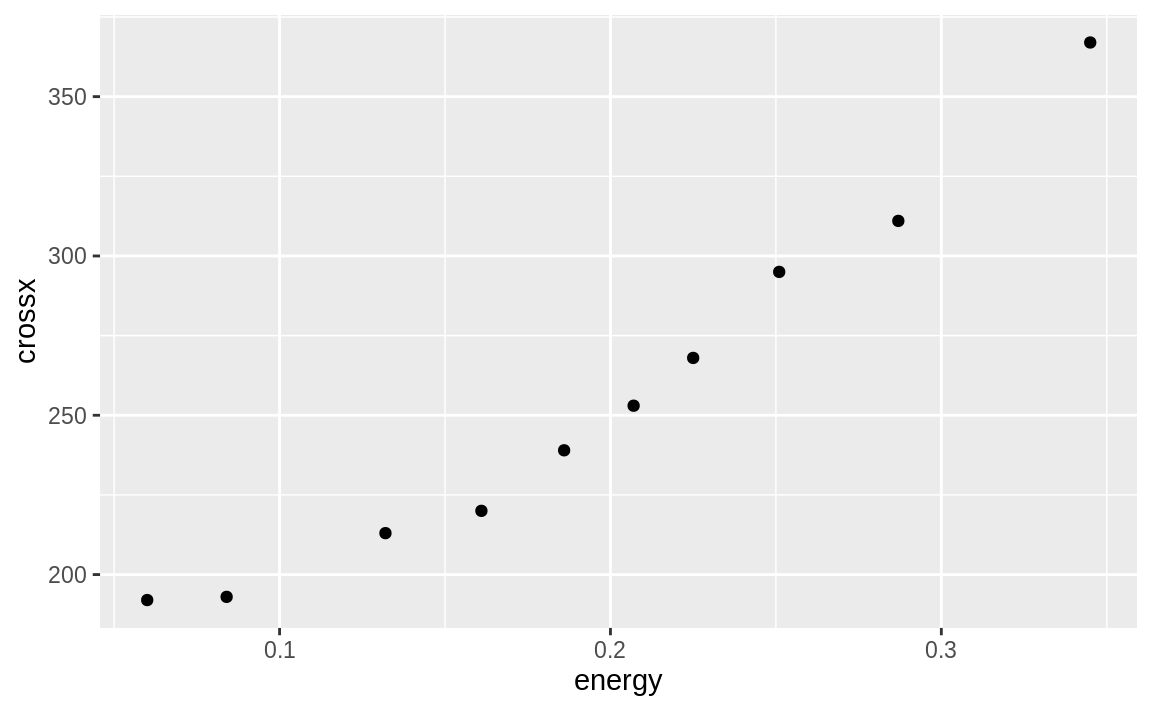
Figure 10.20: strongx scatter plot
ggplot can calculate a linear model on the fly and then plot the regression line along with our data:
g <- ggplot(strongx, aes(energy, crossx)) +
  geom_point()

g + geom_smooth(method = "lm",
                formula = y ~ x)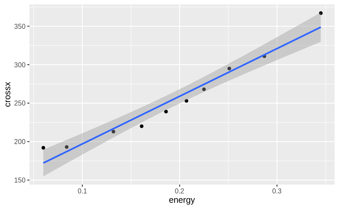
Figure 10.21: Simple linear model ggplot
We can turn the confidence bands off by adding the se = FALSE option, as shown in Figure 10.22:
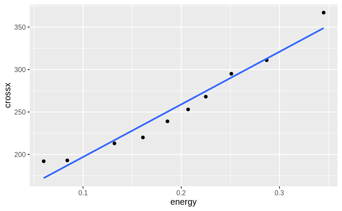
Figure 10.22: Simple linear model ggplot without se
Notice that in the geom_smooth we use x and y rather than the variable names. ggplot has set the x and y inside the plot based on the aesthetic. Multiple smoothing methods are supported by geom_smooth. You can explore those, and other options in the help, by typing **?geom_smooth**.
If we had a line we wanted to plot that was stored in another R object, we could use geom_abline to plot the line on our graph. In the following example we pull the intercept term and the slope from the regression model m and add those to our graph in Figure 10.23:
m <- lm(crossx ~ energy, data = strongx)

ggplot(strongx, aes(energy, crossx)) +
  geom_point() +
  geom_abline(
    intercept = m$coefficients[1],
    slope = m$coefficients[2]
  )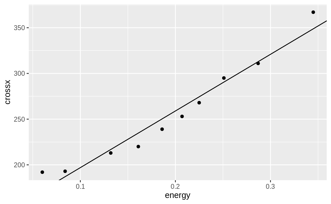
Figure 10.23: Simple line from slope and intercept
This produces a plot very similar to Figure 10.22. The geom_abline method can be handy if you are plotting a line from a source other than a simple linear model.
See Also
See Chapter 11 for more about linear regression and the lm function.
10.8 Plotting All Variables Against All Other Variables
Problem
Your dataset contains multiple numeric variables. You want to see scatter plots for all pairs of variables.
Solution
ggplot does not have any built-in method to create pairs plots; however, the package GGally provides this functionality with the ggpairs function:
Discussion
When you have a large number of variables, finding interrelationships
between them is difficult. One useful technique is looking at scatter
plots of all pairs of variables. This would be quite tedious if coded
pair-by-pair, but the ggpairs function from the package GGally provides an easy way to produce all those scatter
plots at once.
The iris dataset contains four numeric variables and one categorical
variable:
head(iris)
#>   Sepal.Length Sepal.Width Petal.Length Petal.Width Species
#> 1          5.1         3.5          1.4         0.2  setosa
#> 2          4.9         3.0          1.4         0.2  setosa
#> 3          4.7         3.2          1.3         0.2  setosa
#> 4          4.6         3.1          1.5         0.2  setosa
#> 5          5.0         3.6          1.4         0.2  setosa
#> 6          5.4         3.9          1.7         0.4  setosa
What is the relationship, if any, between the columns? Plotting
the columns with ggpairs produces multiple scatter plots, as seen in Figure 10.24.
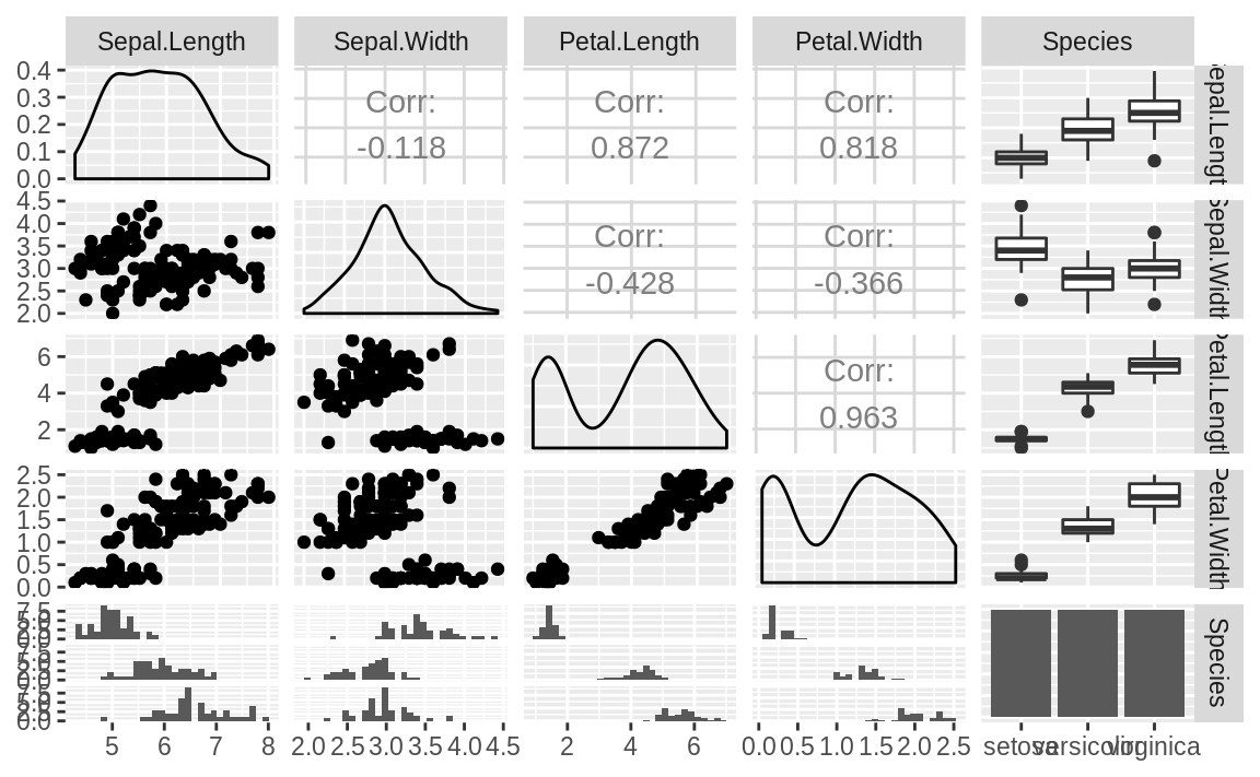
Figure 10.24: ggpairs plot of iris data
The ggpairs function is pretty, but not particularly fast. If you’re just doing interactive work and want a quick peek at the data, the base R plot function provides faster output (see Figure 10.25).
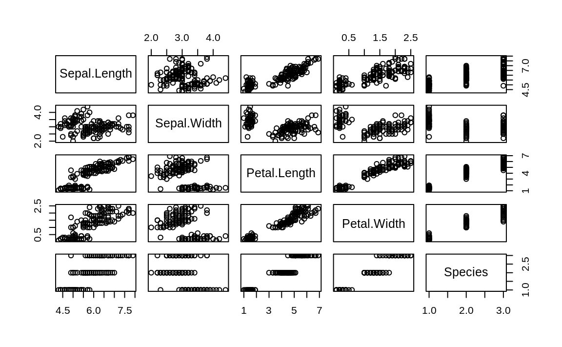
Figure 10.25: Base plot pairs plot
While the ggpairs function is not as fast to plot as the Base R plot function, it produces density graphs on the diagonal and reports correlation in the upper triangle of the graph. When factors or character columns are present, ggpairs produces histograms on the lower triangle of the graph and boxplots on the upper triangle. These are nice additions to understanding relationships in your data.
10.9 Creating One Scatter Plot for Each Group
Problem
Your dataset contains (at least) two numeric variables and a factor or character field defining a group. You want to create several scatter plots for the numeric variables, with one scatter plot for each level of the factor or character field.
Solution
We produce this kind of plot, called a conditioning plot, in ggplot by adding facet_wrap to our plot.
In this example we use the data frame df, which contains three columns: x, y, and f, with f being a factor (or a character string).
Discussion
Conditioning plots (coplots) are another way to explore and illustrate the effect of a factor or to compare different groups to each other.
The Cars93 dataset contains 27 variables describing 93 car models as
of 1993. Two numeric variables are MPG.city, the miles per gallon in
the city, and Horsepower, the engine horsepower. One categorical
variable is Origin, which can be USA or non-USA according to where the
model was built.
Exploring the relationship between MPG and horsepower, we might ask: Is there a different relationship for USA models and non-USA models?
Let’s examine this as a facet plot:
data(Cars93, package = "MASS")
ggplot(Cars93, aes(MPG.city, Horsepower)) +
  geom_point() +
  facet_wrap( ~ Origin)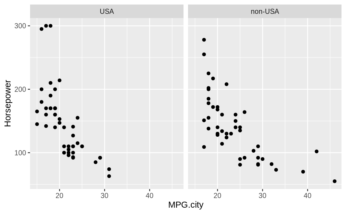
Figure 10.26: Cars data with facet
The resulting plot in Figure 10.26 reveals a few insights. If we really crave that 300-horsepower monster, then we’ll have to buy a car built in the USA; but if we want high MPG, we have more choices among non-USA models. These insights could be teased out of a statistical analysis, but the visual presentation reveals them much more quickly.
Note that using facet results in subplots with the same x- and y-axis ranges. This helps ensure that visual inspection of the data is not misleading because of differing axis ranges.
See Also
The Base R graphics function coplot can accomplish very similar plots using only Base graphics.
10.10 Creating a Bar Chart
Problem
You want to create a bar chart.
Solution
A common situation is to have a column of data that represents a group and then another column that represents a measure about that group. This format is “long” data because the data runs vertically instead of having a column for each group.
Using the geom_bar function in ggplot, we can plot the heights as bars. If the data is already aggregated, we add stat = "identity" so that ggplot knows it needs to do no aggregation on the groups of values before plotting.
Discussion
Let’s use the cars made by Ford in the Cars93 data in an example:
ford_cars <- Cars93 %>%
  filter(Manufacturer == "Ford")

ggplot(ford_cars, aes(Model, Horsepower)) +
  geom_bar(stat = "identity")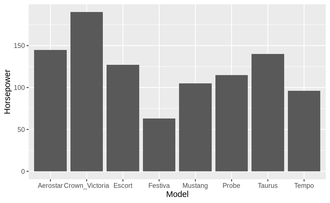
Figure 10.27: Ford cars bar chart
Figure 10.27 shows the resulting bar chart.
This example uses stat = "identity", which assumes that the heights of your bars are conveniently stored as a value in one field with only one record per column. That is not always the case, however. Often you have a vector of numeric data and a
parallel factor or character field that groups the data, and you want to produce a bar
chart of the group means or the group totals.
Let’s work up an example using the built-in airquality dataset, which contains daily temperature data for a single location for five months. The data frame has a numeric Temp column and Month and Day columns. If we want to plot the mean temp by month using ggplot, we don’t need to precompute the mean; instead, we can have ggplot do that in the plot command logic. To tell ggplot to calculate the mean, we pass stat = "summary", fun.y = "mean" to the geom_bar command. We can also turn the month numbers into dates using the built-in constant month.abb, which contains the abbreviations for the months.
ggplot(airquality, aes(month.abb[Month], Temp)) +
  geom_bar(stat = "summary", fun.y = "mean") +
  labs(title = "Mean Temp by Month",
       x = "",
       y = "Temp (deg. F)")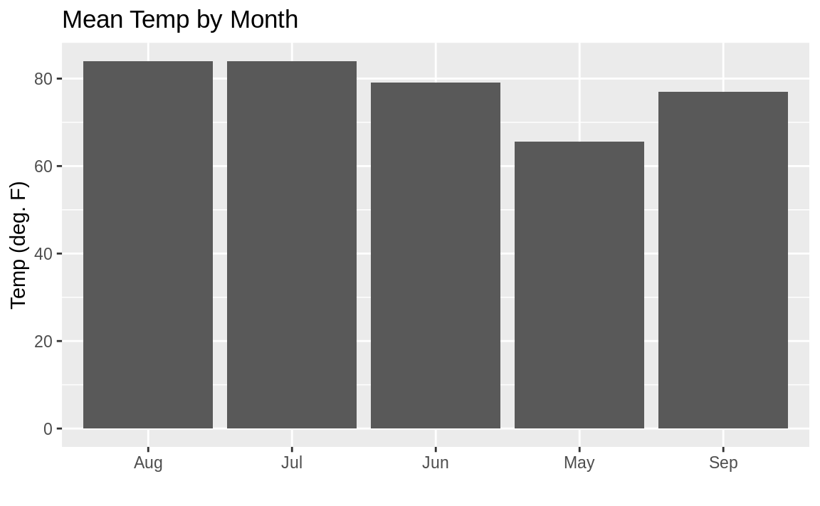
Figure 10.28: Bar chart: Temp by month
Figure 10.28 shows the resulting plot. But you might notice the sort order on the months is alphabetical, which is not how we typically like to see months sorted.
We can fix the sorting issue using a few functions from dplyr combined with fct_inorder from the forcats tidyverse package. To get the months in the correct order, we can sort the data frame by Month, which is the month number. Then we can apply fct_inorder, which will arrange our factors in the order they appear in the data. You can see in Figure 10.29 that the bars are now sorted properly.
library(forcats)

aq_data <- airquality %>%
  arrange(Month) %>%
  mutate(month_abb = fct_inorder(month.abb[Month]))

ggplot(aq_data, aes(month_abb, Temp)) +
  geom_bar(stat = "summary", fun.y = "mean") +
  labs(title = "Mean Temp by Month",
       x = "",
       y = "Temp (deg. F)")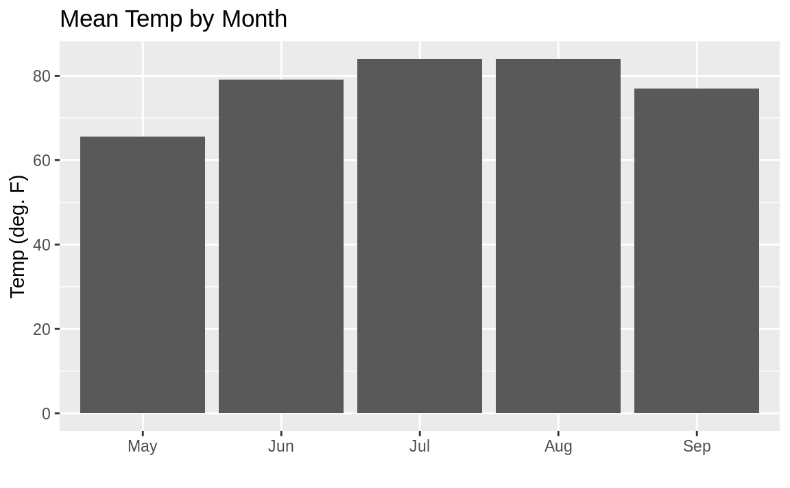
Figure 10.29: Bar chart properly sorted
See Also
See Recipe 10.11, “Adding Confidence Intervals to a Bar Chart”, for adding confidence intervals and Recipe 10.12, “Coloring a Bar Chart”, for adding color.
?geom_bar for help with bar charts in ggplot.
barplot for Base R bar charts or the barchart function in the lattice package.
10.11 Adding Confidence Intervals to a Bar Chart
Problem
You want to augment a bar chart with confidence intervals.
Solution
Suppose you have a data frame df with columns group, which are group names; stat, which is a column of statistics; and lower and upper, which represent the corresponding limits for the confidence intervals. We can display a bar chart of stat for each group and its confidence intervals using the geom_bar combined with geom_errorbar.
ggplot(df, aes(group, stat)) +
  geom_bar(stat = "identity") +
  geom_errorbar(aes(ymin = lower, ymax = upper), width = .2)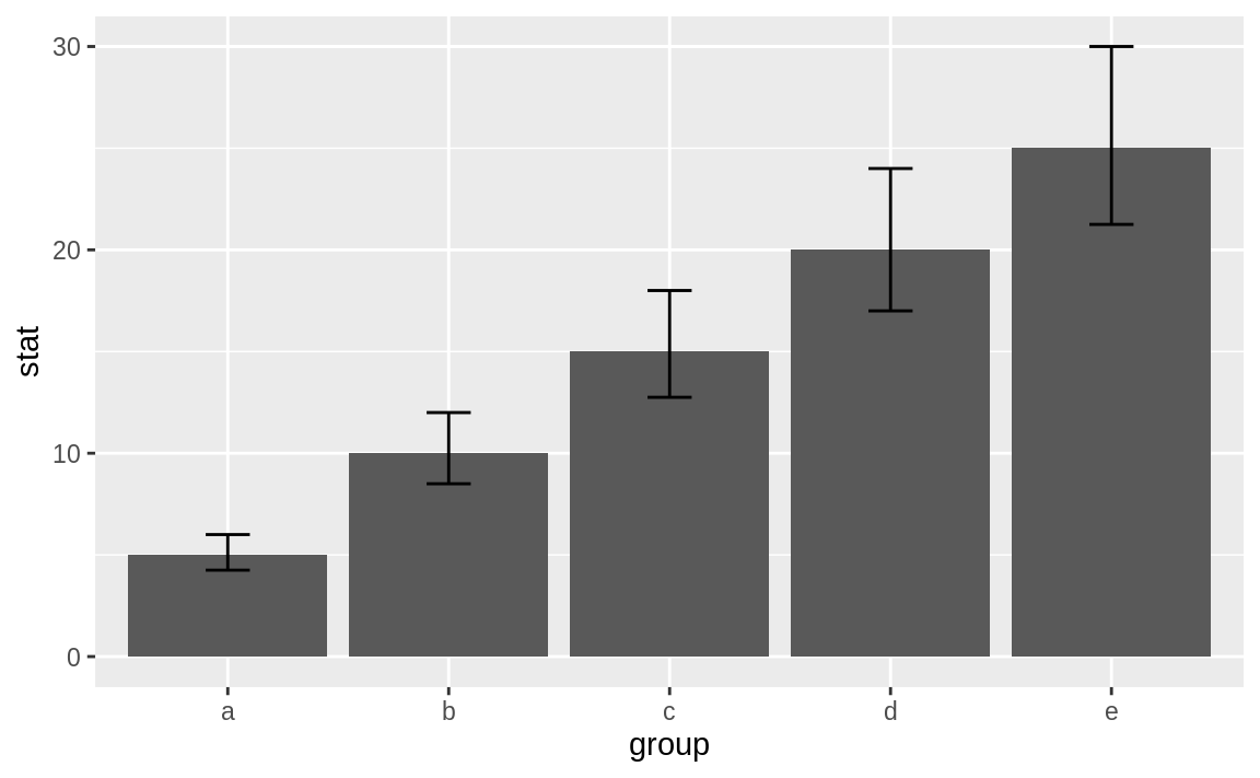
Figure 10.30: Bar chart with confidence intervals
Figure 10.30 shows the resulting bar chart with confidence intervals.
Discussion
Most bar charts display point estimates, which are shown by the heights of the bars, but rarely do they include confidence intervals. Our inner statisticians dislike this intensely. The point estimate is only half of the story; the confidence interval gives the full story.
Fortunately, we can plot the error bars using ggplot. The hard part is calculating the intervals. In the previous examples our data had a simple –15% and +20% interval. However, in
Recipe 10.10, “Creating a Bar Chart”, we calculated group means before
plotting them. If we let ggplot do the calculations for us, we can use the built-in mean_se along with the stat_summary function to get the standard errors of the mean measures.
Let’s use the airquality data we used previously. First we’ll do the sorted factor procedure (from the prior recipe) to get the month names in the desired order:
Now we can plot the bars along with the associated standard errors as in Figure 10.31:
ggplot(aq_data, aes(month_abb, Temp)) +
geom_bar(stat = "summary",
fun.y = "mean",
fill = "cornflowerblue") +
stat_summary(fun.data = mean_se, geom = "errorbar") +
labs(title = "Mean Temp by Month",
x = "",
y = "Temp (deg. F)")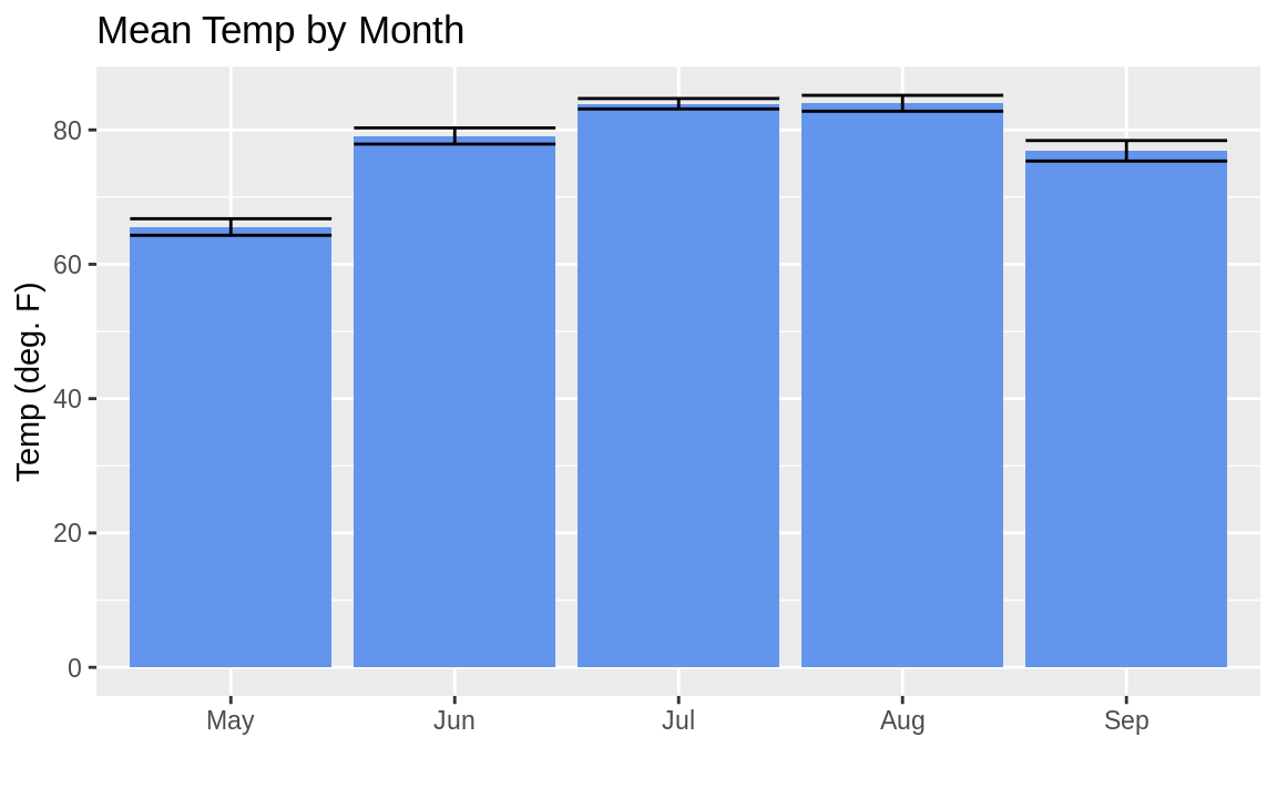
Figure 10.31: Mean temp by month with error bars
Sometimes you’ll want to sort your columns in your bar chart in descending order based on their height. This can be a little bit confusing when you’re using summary stats in ggplot, but the secret is to use mean in the reorder statement to sort the factor by the mean of the temp. Note that the reference to mean in reorder is not quoted, while the reference to mean in geom_bar is quoted:
ggplot(aq_data, aes(reorder(month_abb, -Temp, mean), Temp)) +
geom_bar(stat = "summary",
fun.y = "mean",
fill = "tomato") +
stat_summary(fun.data = mean_se, geom = "errorbar") +
labs(title = "Mean Temp by Month",
x = "",
y = "Temp (deg. F)")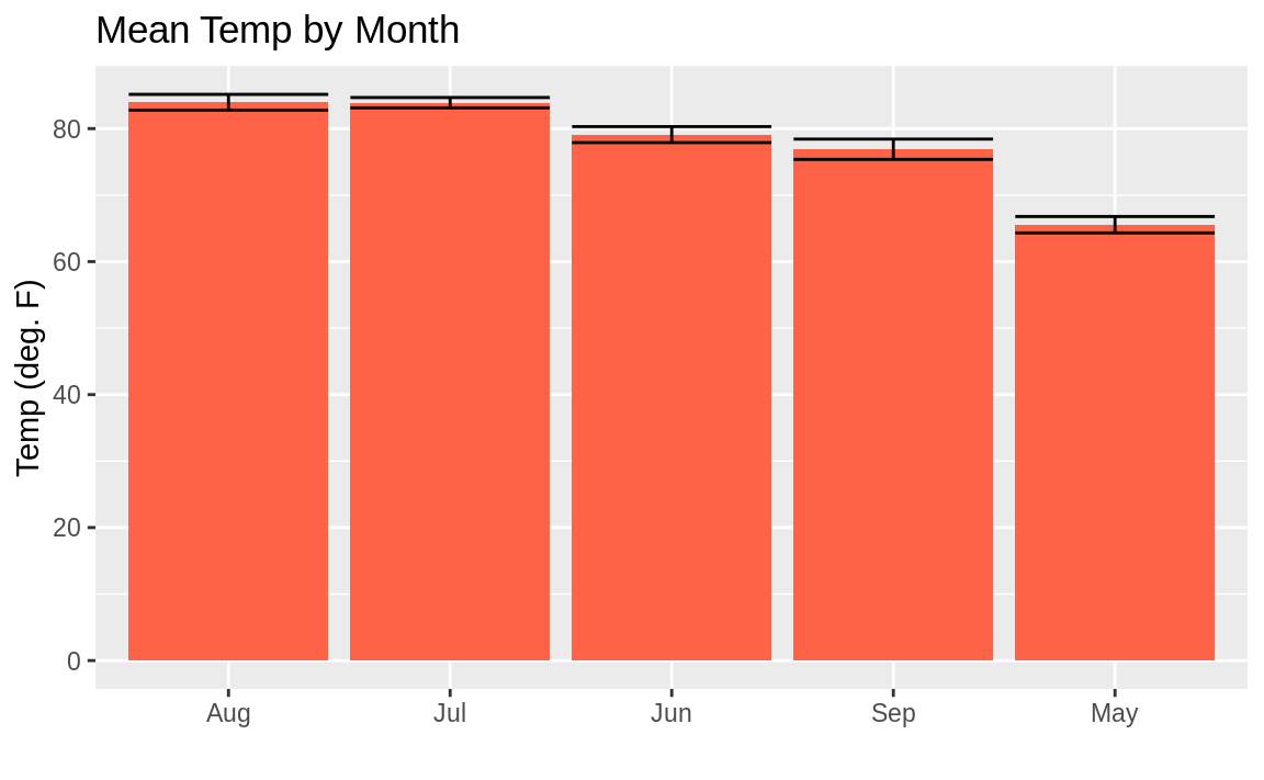
Figure 10.32: Mean temp by month in descending order
You may look at this example and the result in Figure 10.32 and wonder, “Why didn’t they just use reorder(month_abb, Month) in the first example instead of that sorting business with forcats::fct_inorder to get the months in the right order?” Well, we could have. But sorting using fct_inorder is a design pattern that provides flexibility for more complicated things. Plus it’s quite easy to read in a script. Using reorder inside the aes is a bit more dense and hard to read later. But either approach is reasonable.
See Also
See Recipe 9.9, “Forming a Confidence Interval for a Mean”, for more about t.test.
10.12 Coloring a Bar Chart
Problem
You want to color or shade the bars of a bar chart.
Solution
With gplot we add the fill = call to our aes and let ggplot pick the colors for us:
Discussion
In ggplot we can use the fill parameter in aes to tell ggplot what field to base the colors on. If we pass a numeric field to ggplot, we will get a continuous gradient of colors; and if we pass a factor or character field to fill, we will get contrasting colors for each group. Here we pass the character name of each month to the fill parameter:
aq_data <- airquality %>%
  arrange(Month) %>%
  mutate(month_abb = fct_inorder(month.abb[Month]))
ggplot(data = aq_data, aes(month_abb, Temp, fill = month_abb)) +
geom_bar(stat = "summary", fun.y = "mean") +
labs(title = "Mean Temp by Month",
x = "",
y = "Temp (deg. F)") +
scale_fill_brewer(palette = "Paired")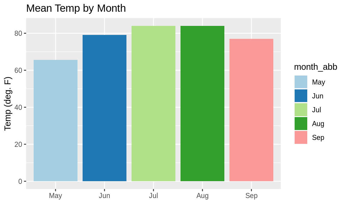
Figure 10.33: Colored monthly temp bar chart
We define the colors in the resulting bar chart (Figure 10.33) by calling scale_fill_brewer(palette="Paired"). The "Paired" color palette comes, along with many other color palettes, in the package RColorBrewer.
If we wanted to change the color of each bar based on the temperature, we can’t just set fill = Temp—as might seem intuitive—because ggplot would not understand we want the mean temperature after the grouping by month. So the way we get around this is to access a special field inside of our graph called ..y.., which is the calculated value on the y-axis. But we don’t want the legend labeled ..y.. so we add fill = "Temp" to our labs call in order to change the name of the legend. The result is shown in Figure 10.34.
ggplot(airquality, aes(month.abb[Month], Temp, fill = ..y..)) +
  geom_bar(stat = "summary", fun.y = "mean") +
  labs(title = "Mean Temp by Month",
       x = "",
       y = "Temp (deg. F)",
       fill = "Temp")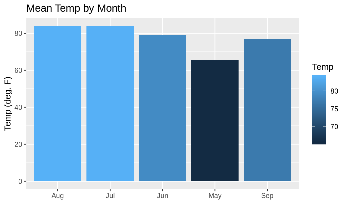
Figure 10.34: Bar chart shaded by value
If we want to reverse the color scale, we can just add a negative sign, -, in front of the field we are filling by: fill= -..y.., for example.
See Also
See Recipe 10.10, “Creating a bar chart”, for creating a bar chart.
10.13 Plotting a Line from x and y Points
Problem
You have paired observations in a data frame: (x1, y1), (x2, y2), …, (xn, yn). You want to plot a series of line segments that connect the data points.
Solution
With ggplot we can use geom_point to plot the points:
Since ggplot graphics are built up, element by element, we can have both a point and a line in the same graphic very easily by having two geoms:
Discussion
To illustrate, let’s look at some example US economic data that comes with ggplot2. This example data frame has a column called date, which we’ll plot on the x-axis and a field unemploy, which is the number of unemployed people.
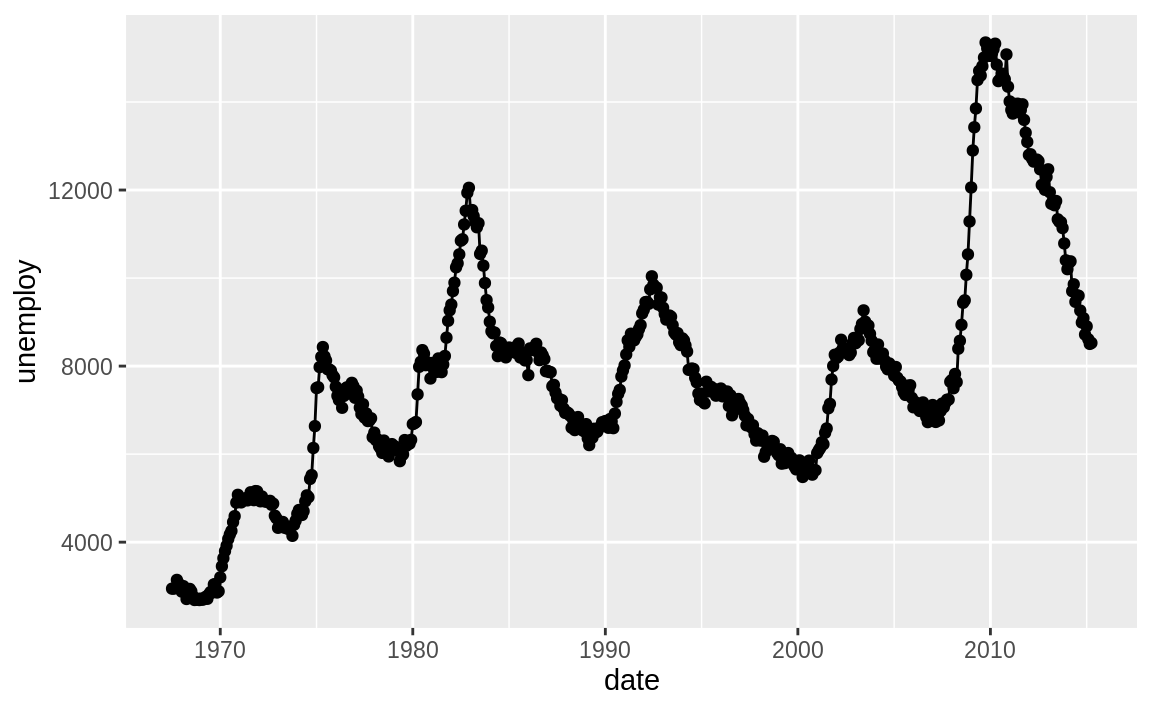
Figure 10.35: Line chart example
Figure 10.35 shows the resulting chart, which contains both lines and points because we used both geoms.
See Also
See Recipe @ref(recipe-id171,) “Creating a Scatter Plot”.
10.14 Changing the Type, Width, or Color of a Line
Problem
You are plotting a line. You want to change the type, width, or color of the line.
Solution
ggplot uses the linetype parameter for controlling the appearance of lines:
linetype="solid"orlinetype=1(default)linetype="dashed"orlinetype=2linetype="dotted"orlinetype=3linetype="dotdash"orlinetype=4linetype="longdash"orlinetype=5linetype="twodash"orlinetype=6linetype="blank"orlinetype=0(inhibits drawing)
You can change the line characteristics by passing linetype, col, and/or size as parameters to the geom_line.
So if we want to change the line type to dashed, red, and heavy, we could pass the linetype, col, and size params to geom_line:
Discussion
The example syntax shows how to draw one line and specify its style, width, or color. A common scenario involves drawing multiple lines, each with its own style, width, or color.
Let’s set up some example data:
In ggplot this can be a conundrum for many users. The challenge is that ggplot works best with “long” data instead of “wide” data,
as was mentioned in the Introduction to this chapter.
Our example data frame has four columns of wide data:
We can make our wide data long by using the gather function from the core tidyverse package tidyr. In this example, we use gather to create a new column named bucket and put our column names in there while keeping our x and y variables.
df_long <- gather(df, bucket, y, -x)
head(df_long, 3)
#>   x bucket    y
#> 1 1     y1 1.00
#> 2 2     y1 2.83
#> 3 3     y1 5.20
tail(df_long, 3)
#>     x bucket   y
#> 28  8     y3 181
#> 29  9     y3 243
#> 30 10     y3 316
Now we can pass bucket to the col parameter and get multiple lines, each a different color:
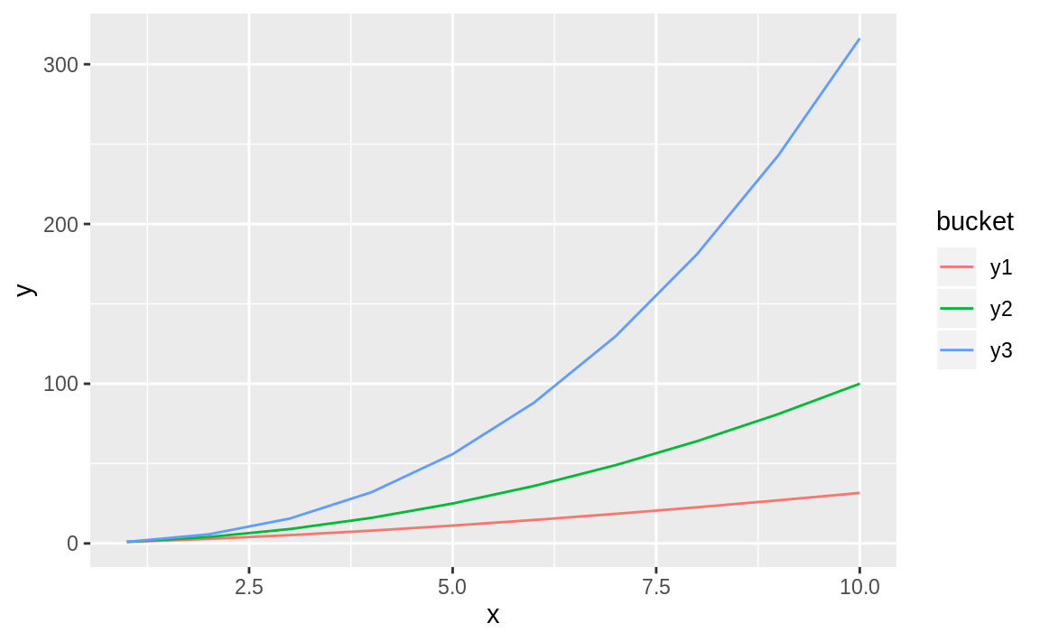
Figure 10.36: Multiple line chart
Figure 10.36 shows the resulting graph with each variable represented in a different color.
It’s straightforward to vary the line weight by a variable by passing a numerical variable to size:
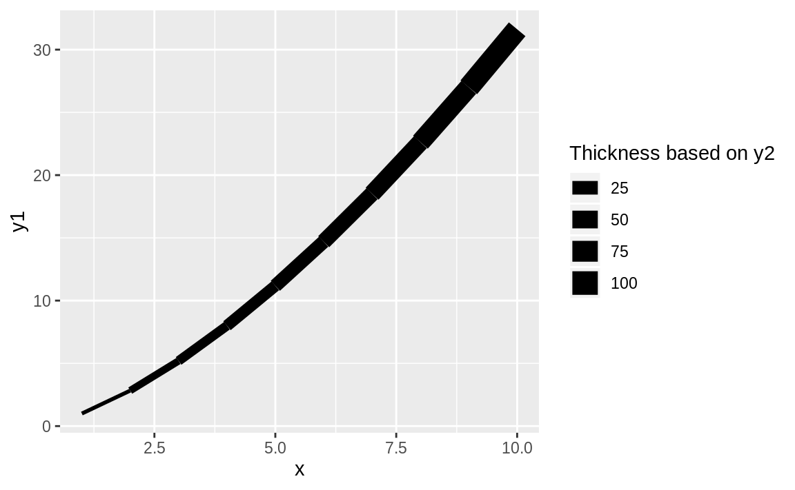
Figure 10.37: Thickness as a function of x
The result of varying the thickness with x is shown in Figure 10.37.
See Also
See Recipe 10.13, “Plotting a Line from x and y Points”, for plotting a basic line.
10.15 Plotting Multiple Datasets
Problem
You want to show multiple datasets in one plot.
Solution
We can add multiple data frames to a ggplot figure by creating an empty plot and then adding two different geoms to the plot:
This code uses geom_line but these could be any geom.
Discussion
We could combine the data into one data frame before plotting using one of the join functions from dplyr. However, next we will create two separate data frames and then add them each to a ggplot graph.
First let’s set up our example data frames, df1 and df2:
# example data
n <- 20

x1 <- 1:n
y1 <- rnorm(n, 0, .5)
df1 <- data.frame(x1, y1)

x2 <- (.5 * n):((1.5 * n) - 1)
y2 <- rnorm(n, 1, .5)
df2 <- data.frame(x2, y2)
Typically we would pass the data frame directly into the ggplot function call. Since we want two geoms with two different data sources, we will initiate a plot with ggplot and then add in two calls to geom_line, each with its own data source.
ggplot() +
  geom_line(data = df1, aes(x1, y1), color = "darkblue") +
  geom_line(data = df2, aes(x2, y2), linetype = "dashed")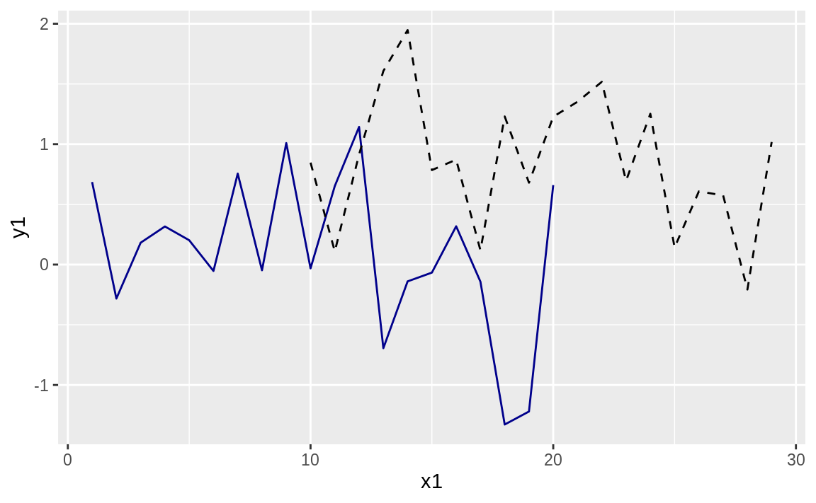
Figure 10.38: Two lines, one plot
ggplot allows us to make multiple calls to different geom_ functions, each with its own data source, if desired. Then ggplot will look at all the data we are plotting and adjust the ranges to accommodate all the data.
The graph with expanded limits is shown in Figure 10.38.
10.16 Adding Vertical or Horizontal Lines
Problem
You want to add a vertical or horizontal line to your plot, such as an axis through the origin or a pointer to a threshold.
Solution
The ggplot functions geom_vline and geom_hline produce vertical and horizontal lines, respectively. The functions can also take color, linetype, and size parameters to set the line style:
# using the data.frame df1 from the prior recipe
ggplot(df1) +
  aes(x = x1, y = y1) +
  geom_point() +
  geom_vline(
    xintercept = 10,
    color = "red",
    linetype = "dashed",
    size = 1.5
  ) +
  geom_hline(yintercept = 0, color = "blue")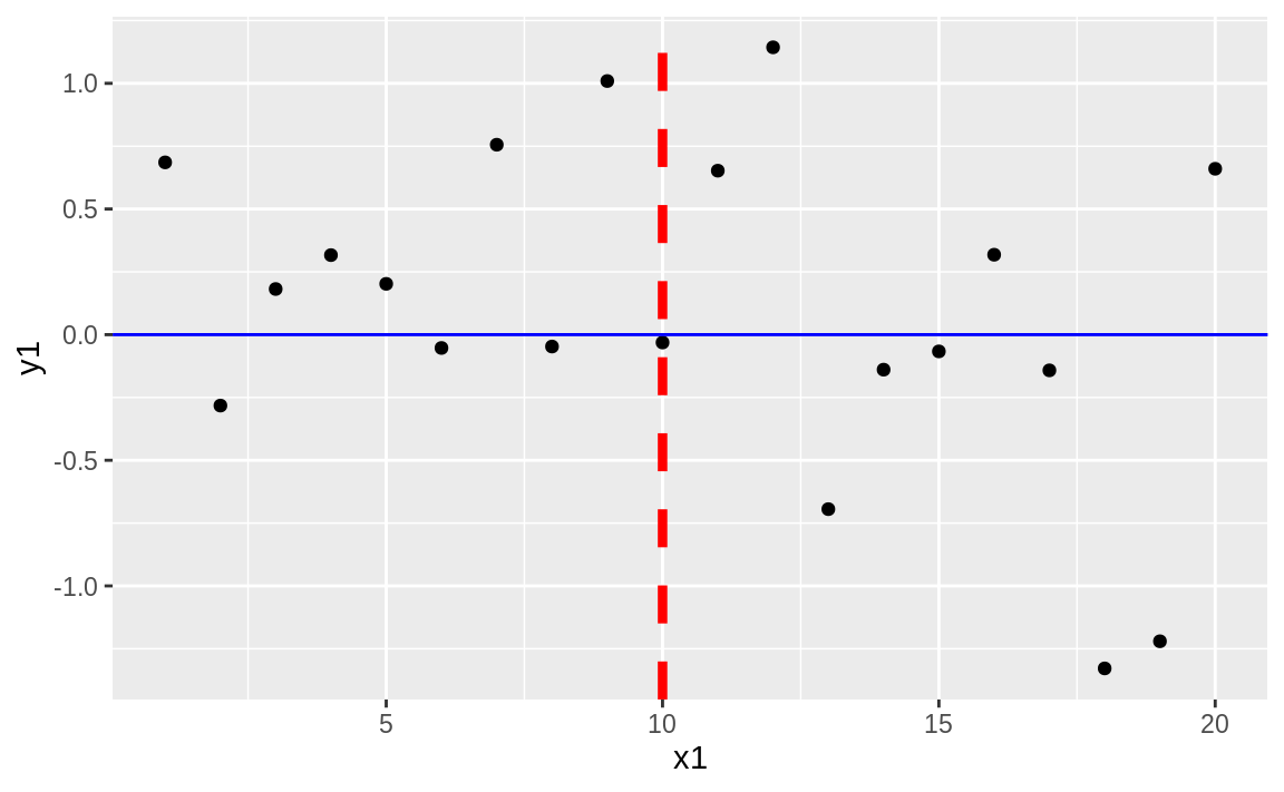
Figure 10.39: Vertical and horizontal lines
Figure 10.39 shows the resulting plot with added horizontal and vertical lines.
Discussion
A typical use of lines would be drawing regularly spaced lines. Suppose we have a sample of points, samp. First, we plot them with a solid line through the mean. Then we calculate and draw dotted lines at ±1 and ±2 standard deviations away
from the mean. We can add the lines into our plot with geom_hline:
samp <- rnorm(1000)
samp_df <- data.frame(samp, x = 1:length(samp))

mean_line <- mean(samp_df$samp)
sd_lines <- mean_line + c(-2, -1, +1, +2) * sd(samp_df$samp)

ggplot(samp_df) +
  aes(x = x, y = samp) +
  geom_point() +
  geom_hline(yintercept = mean_line, color = "darkblue") +
  geom_hline(yintercept = sd_lines, linetype = "dotted")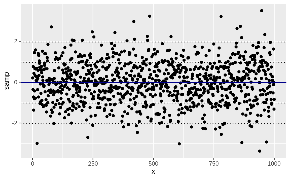
Figure 10.40: Mean and SD bands in a plot
Figure 10.40 shows the sampled data along with the mean and standard deviation lines.
See Also
See Recipe 10.14, “Changing the Type, Width, or Color of a Line”, for more about changing line types.
10.17 Creating a Boxplot
Problem
You want to create a boxplot of your data.
Solution
Use geom_boxplot from ggplot to add a boxplot geom to a ggplot graphic. Using the samp_df data frame from the prior recipe, we can create a boxplot of the values in the x column. The resulting graph is shown in Figure 10.41.
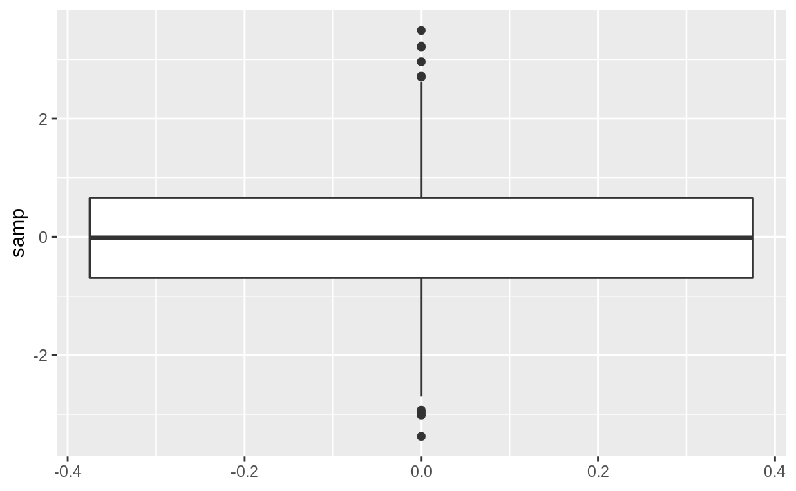
Figure 10.41: Single boxplot
Discussion
A boxplot provides a quick and easy visual summary of a dataset.
The thick line in the middle is the median.
The box surrounding the median identifies the first and third quartiles; the bottom of the box is Q1, and the top is Q3.
The “whiskers” above and below the box show the range of the data, excluding outliers.
The circles identify outliers. By default, an outlier is defined as any value that is farther than 1.5×IQR away from the box. (IQR is the interquartile range, or Q3–Q1.) In this example, there are a few outliers on the high side.
We can rotate the boxplot by flipping the coordinates. There are some situations where this makes a more appealing graphic, as shown in Figure 10.42.
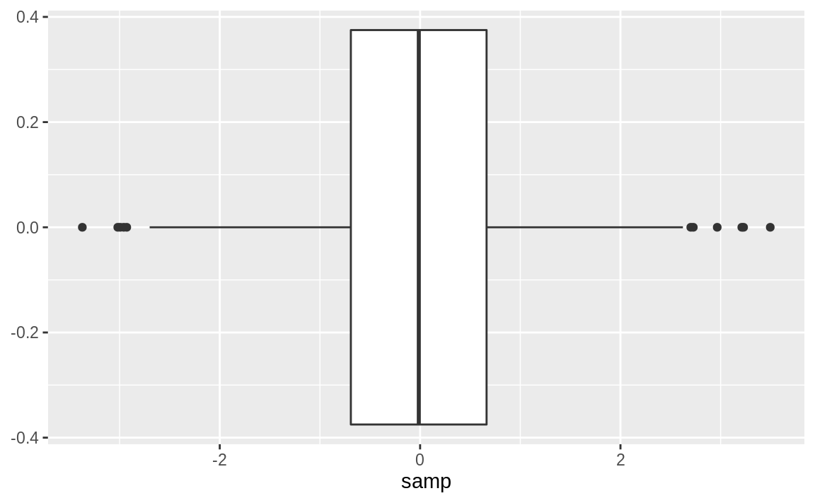
Figure 10.42: Single Boxplot
See Also
One boxplot alone is pretty boring. See Recipe 10.18, “Creating One Boxplot for Each Factor Level”, for creating multiple boxplots.
10.18 Creating One Boxplot for Each Factor Level
Problem
Your dataset contains a numeric variable and a factor (or other catagorical text). You want to create several boxplots of the numeric variable broken out by levels.
Solution
With ggplot we pass the name of the categorical variable to the x parameter in the aes call. The resulting boxplot will then be grouped by the values in the categorical variable:
Discussion
This recipe is another great way to explore and illustrate the relationship between two variables. In this case, we want to know whether the numeric variable changes according to the level of a category.
The UScereal dataset from the MASS package contains many variables regarding breakfast
cereals. One variable is the amount of sugar per portion and another is
the shelf position (counting from the floor). Cereal manufacturers can
negotiate for shelf position, placing their product for the best sales
potential. We wonder: Where do they put the high-sugar cereals? We can produce Figure 10.43 and
explore that question by creating one boxplot per shelf:
data(UScereal, package = "MASS")

ggplot(UScereal) +
  aes(x = as.factor(shelf), y = sugars) +
  geom_boxplot() +
  labs(
    title = "Sugar Content by Shelf",
    x = "Shelf",
    y = "Sugar (grams per portion)"
  )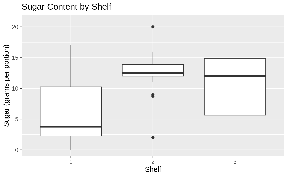
Figure 10.43: Boxplot by shelf number
The boxplots suggest that shelf #2 has the most high-sugar cereals. Could it be that this shelf is at eye level for young children who can influence their parents’ choice of cereals?
Note that in the aes call we had to tell ggplot to treat the shelf number as a factor. Otherwise, ggplot would not react to the shelf as a grouping and print only a single boxplot.
See Also
See Recipe @ref(recipe-id178,) “Creating a Boxplot”, for creating a basic boxplot.
10.19 Creating a Histogram
Problem
You want to create a histogram of your data.
Solution
Use geom_histogram, and set x to a vector of numeric values.
Discussion
Figure 10.44 is a histogram of the MPG.city column taken from the Cars93 dataset:
data(Cars93, package = "MASS")

ggplot(Cars93) +
  geom_histogram(aes(x = MPG.city))
#> `stat_bin()` using `bins = 30`. Pick better value with `binwidth`.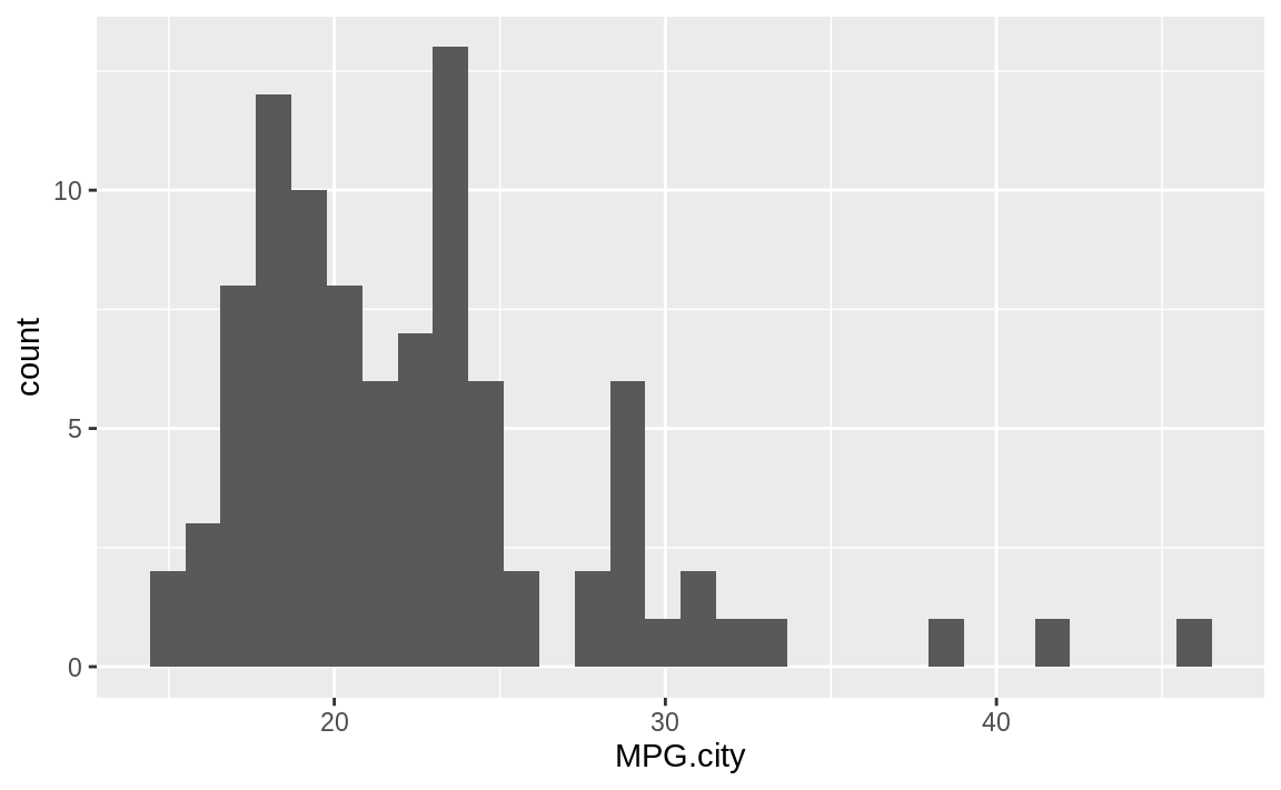
Figure 10.44: Histogram of counts by MPG
The geom_histogram function must decide how many cells (bins) to create for
binning the data. In this example, the default algorithm chose 30
bins. If we wanted fewer bins, we would include the bins parameter to tell geom_histogram how many bins we want:
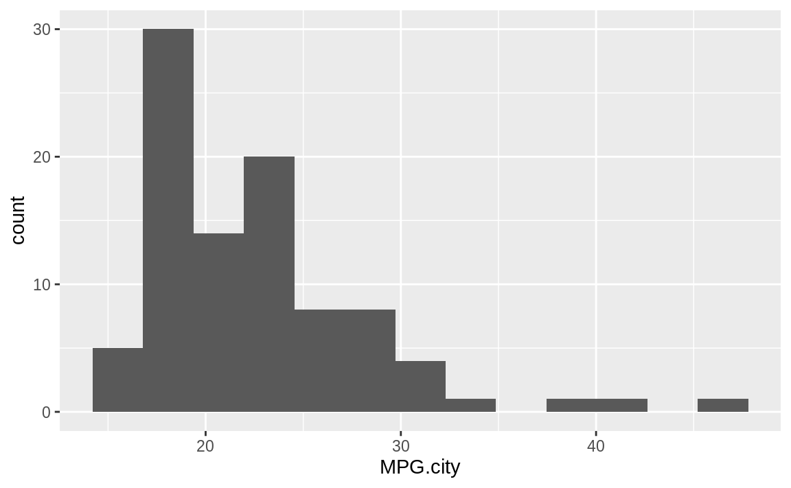
Figure 10.45: Histogram of counts by MPG with fewer bins
Figure 10.45 shows the histogram with 13 bins.
See Also
The Base R function hist provides much of the same functionality, as does the histogram function of the lattice package.
10.20 Adding a Density Estimate to a Histogram
Problem
You have a histogram of your data sample, and you want to add a curve to illustrate the apparent density.
Solution
Use the geom_density function to approximate the sample density, as shown in Figure 10.46:
ggplot(Cars93) +
  aes(x = MPG.city) +
  geom_histogram(aes(y = ..density..), bins = 21) +
  geom_density()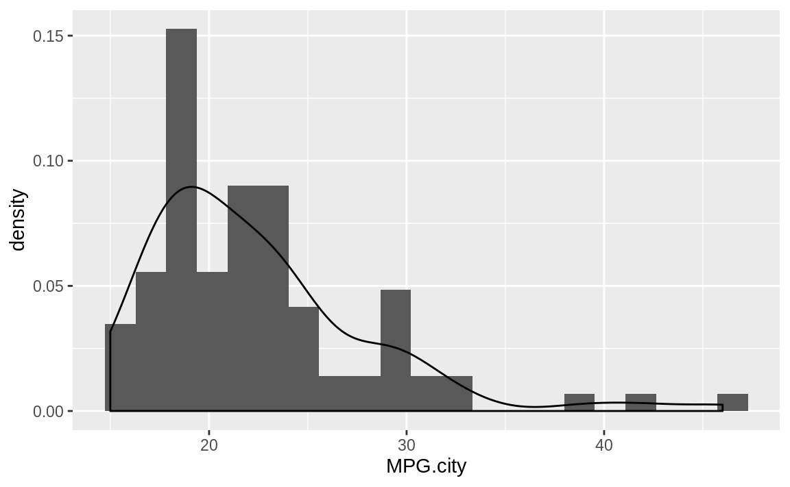
Figure 10.46: Histogram with density plot
Discussion
A histogram suggests the density function of your data, but it is rough. A smoother estimate could help you better visualize the underlying distribution. A kernel density estimation (KDE) is a smoother representation of univariate data.
In ggplot we tell the geom_histogram function to use the geom_density function by passing it aes(y = ..density..).
The following example takes a sample from a gamma distribution and then plots the histogram and the estimated density, as shown in Figure 10.47.
samp <- rgamma(500, 2, 2)

ggplot() +
  aes(x = samp) +
  geom_histogram(aes(y = ..density..), bins = 10) +
  geom_density()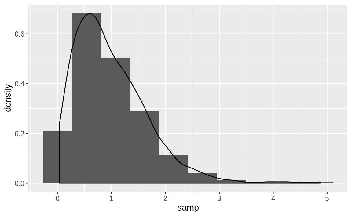
Figure 10.47: Histogram and density: Gamma distribution
See Also
The geom_density function approximates the shape of the density
nonparametrically. If you know the actual underlying distribution, use
instead Recipe 8.11, “Plotting a Density Function”, to plot the density function.
10.21 Creating a Normal Quantile–Quantile Plot
Problem
You want to create a quantile–quantile (Q–Q) plot of your data, typically because you want to know how the data differs from a normal distribution.
Solution
With ggplot we can use the stat_qq and stat_qq_line functions to create a Q–Q plot that shows both the observed points as well as the Q–Q line. Figure 10.48 shows the resulting plot.
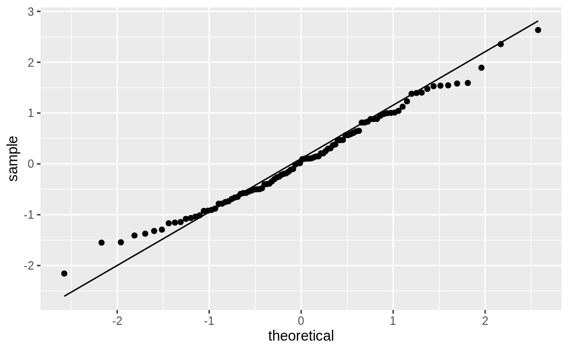
Figure 10.48: Q–Q plot
Discussion
Sometimes it’s important to know if your data is normally distributed. A quantile–quantile (Q–Q) plot is a good first check.
The Cars93 dataset contains a Price column. Is it normally
distributed? This code snippet creates a Q–Q plot of Price, as shown in Figure 10.49:
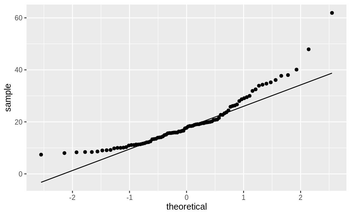
Figure 10.49: Q–Q plot of car prices
If the data had a perfect normal distribution, then the points would fall exactly on the diagonal line. Many points are close, especially in the middle section, but the points in the tails are pretty far off. Too many points are above the line, indicating a general skew to the left.
The leftward skew might be cured by a logarithmic transformation. We can
plot log(Price), which yields Figure 10.50:
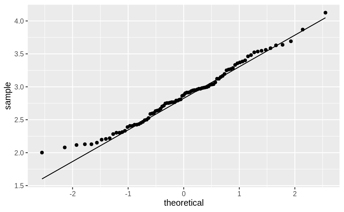
Figure 10.50: Q–Q plot of log car prices
Notice that the points in the new plot are much better behaved, staying
close to the line except in the extreme left tail. It appears that
log(Price) is approximately normal.
See Also
See Recipe 10.22, “Creating Other Quantile–Quantile Plots”, for creating Q–Q plots for other distributions. See Recipe 11.16, “Diagnosing a Linear Regression”, for an application of normal Q–Q plots to diagnose linear regression.
10.22 Creating Other Quantile–Quantile Plots
Problem
You want to view a quantile-quantile plot for your data, but the data is not normally distributed.
Solution
For this recipe, you must have some idea of the underlying distribution, of course. The solution is built from the following steps:
Use the
ppointsfunction to generate a sequence of points between 0 and 1.Transform those points into quantiles, using the quantile function for the assumed distribution.
Sort your sample data.
Plot the sorted data against the computed quantiles.
Use
ablineto plot the diagonal line.
This can all be done in two lines of R code. Here is an example that
assumes your data, y, has a Student’s t distribution with 5 degrees
of freedom. Recall that the quantile function for Student’s t is qt
and that its second argument is the degrees of freedom.
First let’s make some example data:
In order to create the Q–Q plot we need to estimate the parameters of the distribution we’re wanting to plot. Since this is a Student’s t distribution, we only need to estimate one parameter, the degrees of freedom. Of course we know the actual degrees of freedom is 5, but in most situations we’ll need to calcuate that value. So, we’ll use the MASS::fitdistr function to estimate the degrees of freedom:
As expected, that’s pretty close to what was used to generate the simulated data, so let’s pass the estimated degrees of freedom to the Q–Q functions and create Figure 10.51:
ggplot(df_t) +
  aes(sample = y) +
  geom_qq(distribution = qt, dparams = est_df) +
  stat_qq_line(distribution = qt, dparams = est_df)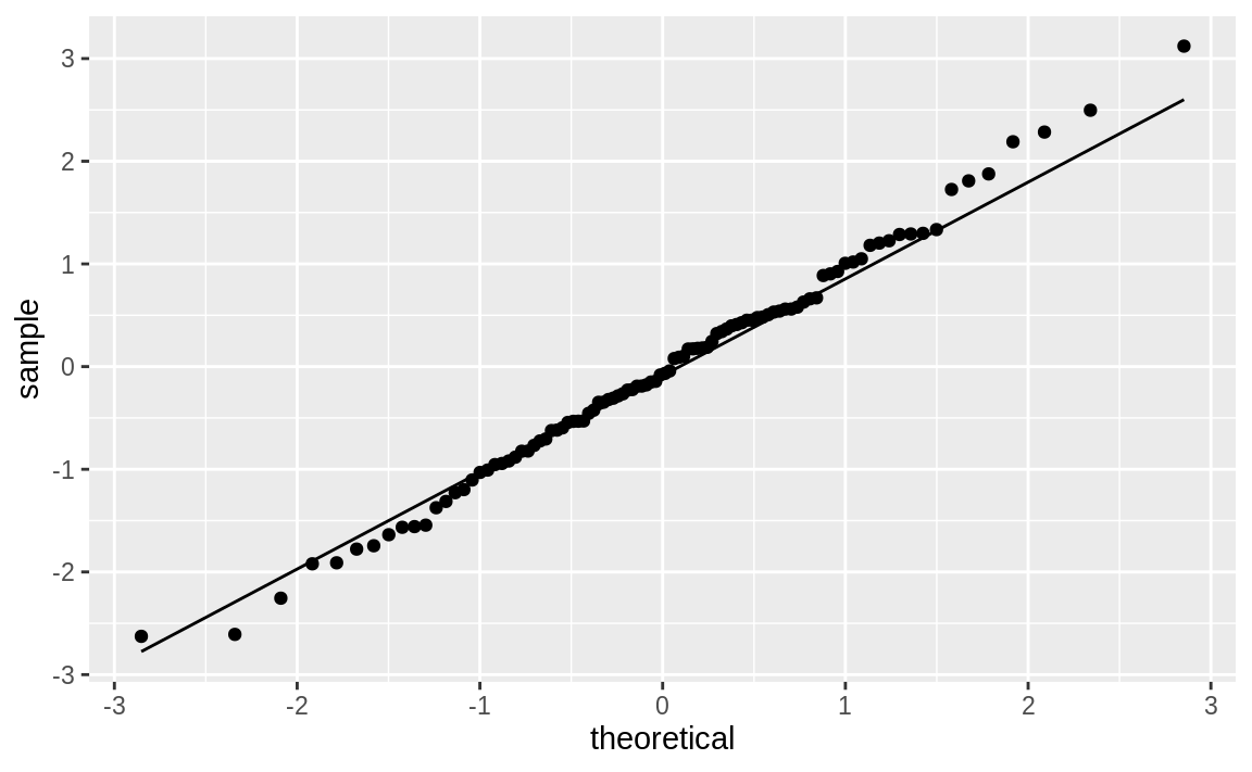
Figure 10.51: Student’s t distribution Q–Q plot
Discussion
The Solution looks complicated, but the gist of it is picking a distribution, fitting the parameters, and then passing those parameters to the Q–Q functions in ggplot.
We can illustrate this recipe by taking a random sample from an exponential distribution with a mean of 10 (or, equivalently, a rate of 1/10):
Notice that for an exponential distribution, the parameter we estimate is called rate as opposed to df, which was the parameter in the t distribution.
ggplot(df_exp) +
  aes(sample = y) +
  geom_qq(distribution = qexp, dparams = est_exp) +
  stat_qq_line(distribution = qexp, dparams = est_exp)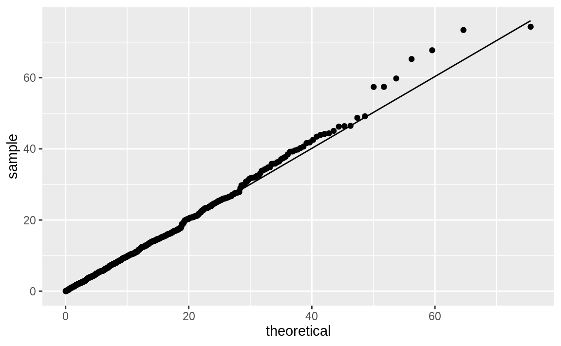
Figure 10.52: Exponential distribution Q–Q plot
The quantile function for the exponential distribution is qexp, which
takes the rate argument. Figure 10.52 shows the resulting Q–Q plot using a theoretical exponential distribution.
10.23 Plotting a Variable in Multiple Colors
Problem
You want to plot your data in multiple colors, typically to make the plot more informative, readable, or interesting.
Solution
We can pass a color to a geom_ function in order to produce colored output:
df <- data.frame(x = rnorm(200), y = rnorm(200))

ggplot(df) +
  aes(x = x, y = y) +
  geom_point(color = "blue")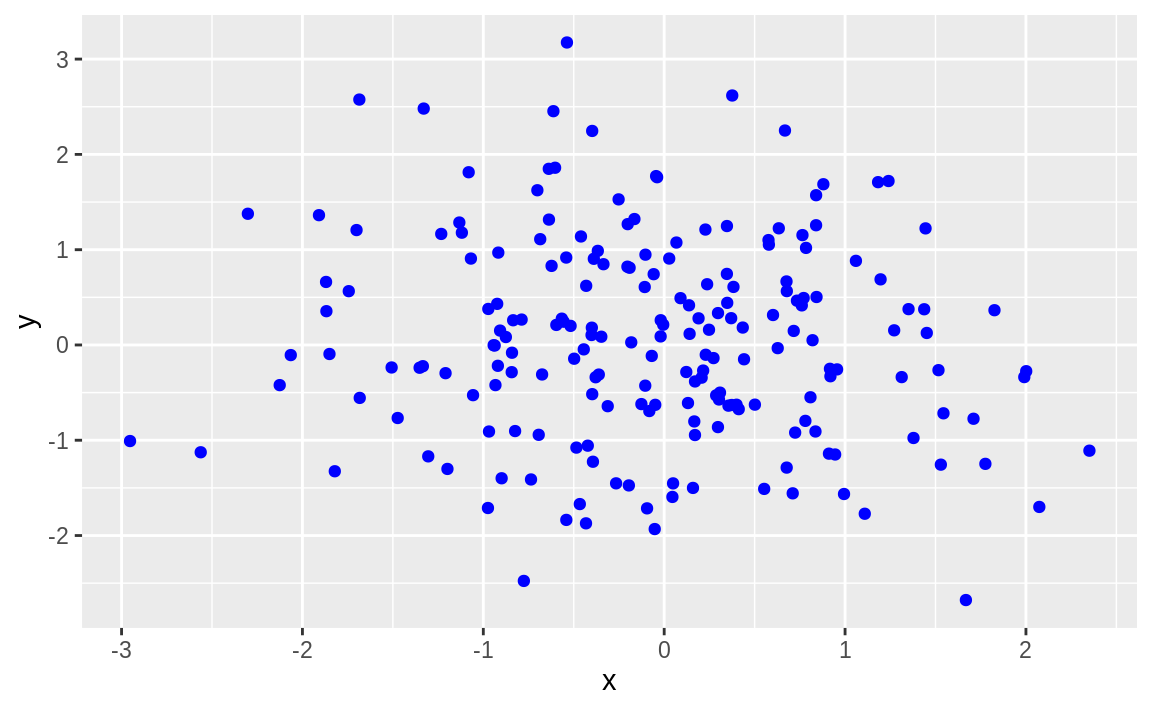
Figure 10.53: Point data in color
If you are reading this in print you may see only black. Try it out on your own in order to see the graph in full color.
The value of color can be:
One color, in which case all data points are that color.
A vector of colors, the same length as
x, in which case each value ofxis colored with its corresponding color.A short vector, in which case the vector of colors is recycled.
Discussion
The default color in ggplot is black. While it’s not very exciting, black is high contrast and easy for almost anyone to see.
However, it is much more useful (and interesting) to vary the color in a way that illuminates the data. Let’s illustrate this by plotting a graphic two ways, once in black and white and once with simple shading.
This produces the basic black-and-white graphic in Figure 10.54:
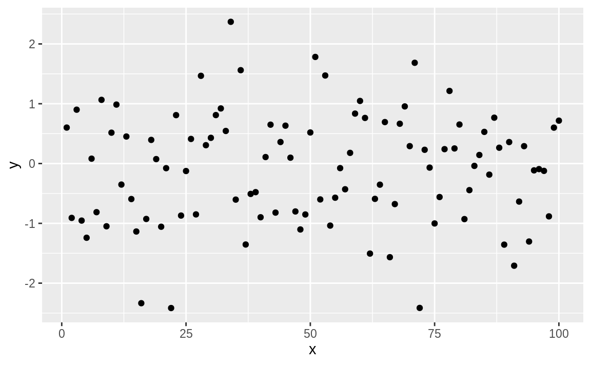
Figure 10.54: Simple point plot
Now we can make it more interesting by
creating a vector of "gray" and "black" values, according to the sign of x, and then plotting x using those colors, as shown in Figure 10.55:
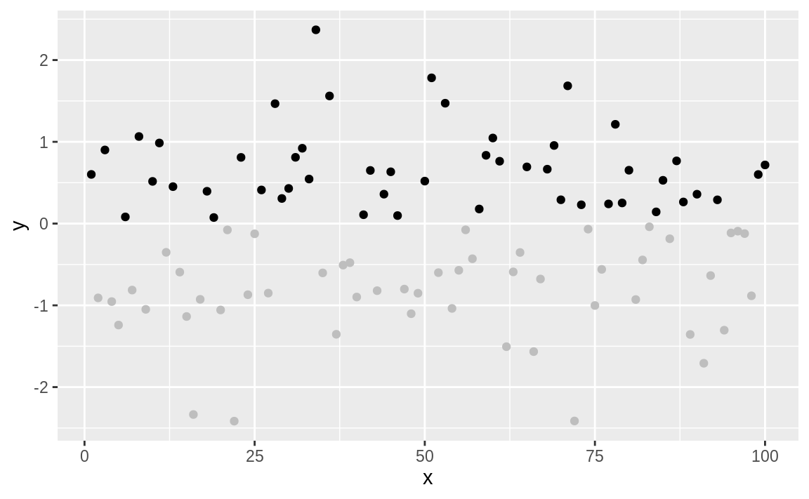
Figure 10.55: Color-shaded point plot
The negative values are now plotted in gray because the corresponding
element of colors is "gray".
See Also
See Recipe 5.3, “Understanding the Recycling Rule”, regarding the Recycling Rule. Execute colors to see a list of available colors, and use geom_segment in ggplot to plot line segments in multiple colors.
10.24 Graphing a Function
Problem
You want to graph the value of a function.
Solution
The ggplot function stat_function will graph a function across a range. In Figure 10.56, we plot a sine wave across the range –3 to 3.
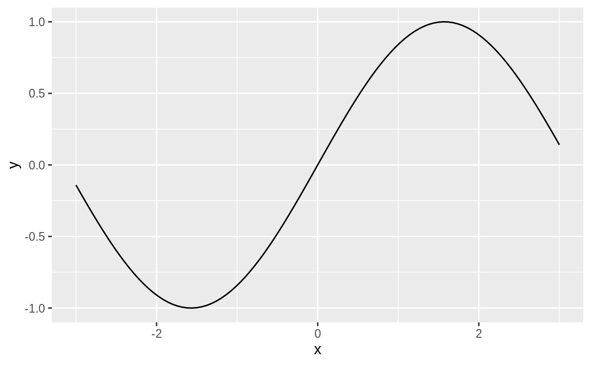
Figure 10.56: Sine wave plot
Discussion
It’s pretty common to want to plot a statistical function, such as a normal distribution, across a given range. The stat_function in ggplot allows us to do this. We need only supply a data frame with x value limits and stat_function will calculate the y values, and plot the results as in Figure 10.57:
ggplot(data.frame(x = c(-3.5, 3.5))) +
  aes(x) +
  stat_function(fun = dnorm) +
  ggtitle("Standard Normal Density")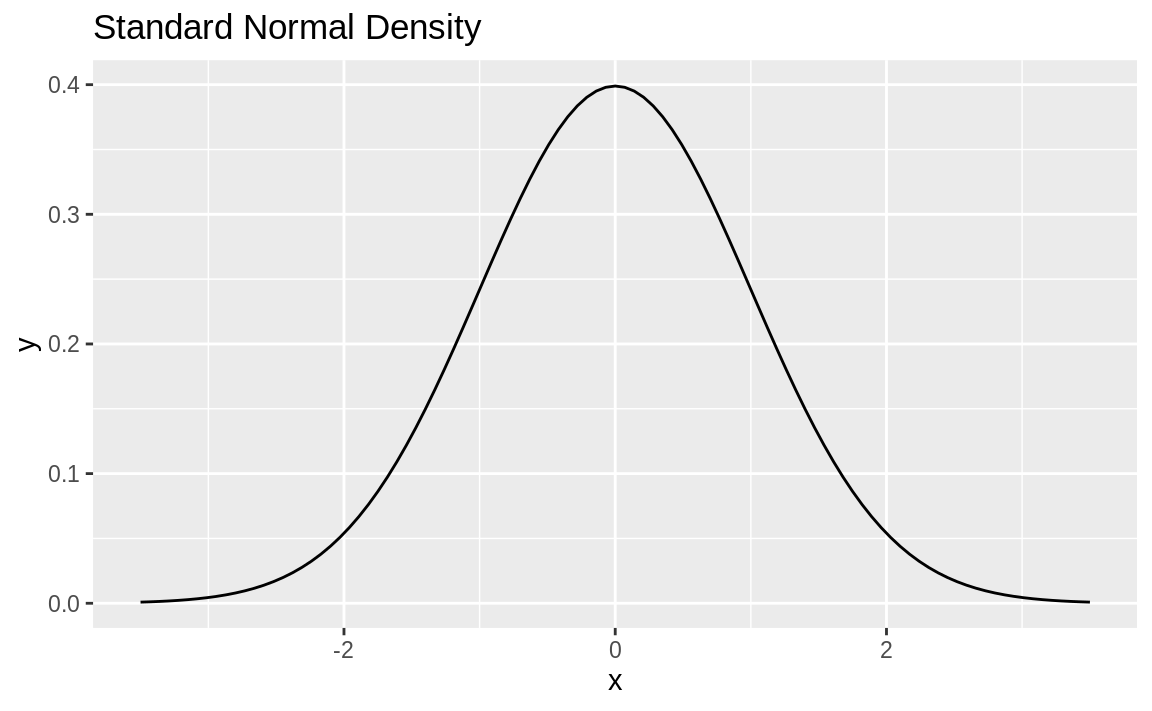
Figure 10.57: Standard normal density plot
Notice in Figure 10.57 we use ggtitle to set the title. If setting multiple text elements in a ggplot, we use labs but when we’re just adding a title, ggtitle is more concise than labs(title='Standard Normal Density') although they accomplish the same thing. See ?labs for more discussion of labels with ggplot.
stat_function can graph any function that takes one argument and returns one
value. Let’s create a function and then plot it. Our function is a damped sine wave—that is, a sine wave that loses amplitude as it moves away from 0:
ggplot(data.frame(x = c(-3.5, 3.5))) +
  aes(x) +
  stat_function(fun = f) +
  ggtitle("Dampened Sine Wave")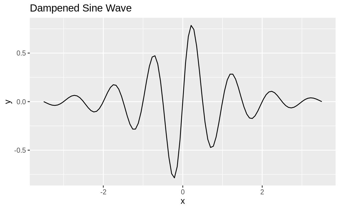
Figure 10.58: Dampened sine wave
The resulting plot is shown in Figure 10.58.
See Also
See Recipe 15.3, “Defining a Function”, for how to define a function.
10.25 Displaying Several Figures on One Page
Problem
You want to display several plots side-by-side on one page.
Solution
There are a number of ways to put ggplot graphics into a grid, but one of the easiest to use and understand is patchwork by Thomas Lin Pedersen. patchwork is not currently available on CRAN, but you can install it from GitHub using the devtools package:
After installing the package, we can use it to plot multiple ggplot objects using a + between the objects, then a call to plot_layout to arrange the images into a grid, as shown in Figure 10.59. Our example code here has four ggplot objects:
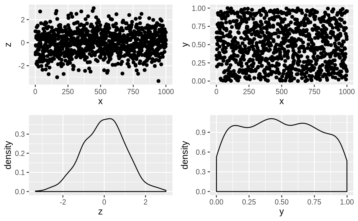
Figure 10.59: A patchwork plot
patchwork supports grouping with parentheses and using / to put groupings under other elements, as illustrated in Figure 10.60.
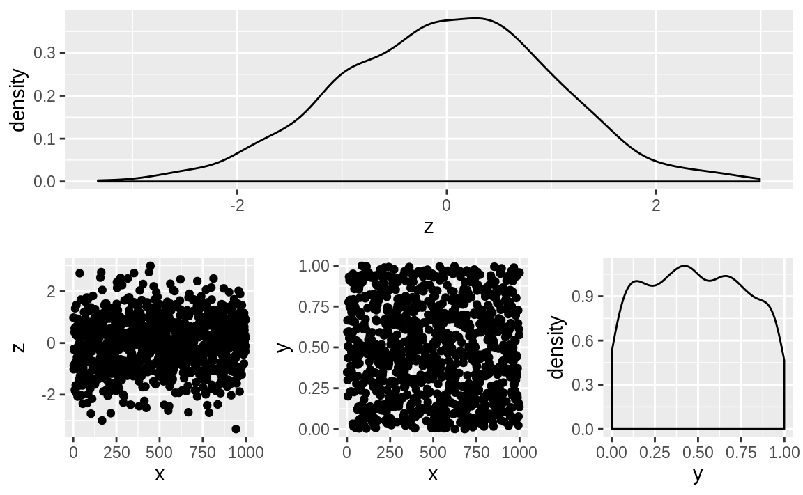
Figure 10.60: A patchwork 1 / 2 plot
Discussion
Let’s use a multifigure plot to display four different beta
distributions. Using ggplot and the patchwork package, we can create a 2x2 layout effect by creating four graphics objects and then print them using the + notation from patchwork:
library(patchwork)

df <- data.frame(x = c(0, 1))

g1 <- ggplot(df) +
  aes(x) +
  stat_function(
    fun = function(x)
      dbeta(x, 2, 4)
  ) +
  ggtitle("First")

g2 <- ggplot(df) +
  aes(x) +
  stat_function(
    fun = function(x)
      dbeta(x, 4, 1)
  ) +
  ggtitle("Second")

g3 <- ggplot(df) +
  aes(x) +
  stat_function(
    fun = function(x)
      dbeta(x, 1, 1)
  ) +
  ggtitle("Third")

g4 <- ggplot(df) +
  aes(x) +
  stat_function(
    fun = function(x)
      dbeta(x, .5, .5)
  ) +
  ggtitle("Fourth")

g1 + g2 + g3 + g4 + plot_layout(ncol = 2, byrow = TRUE)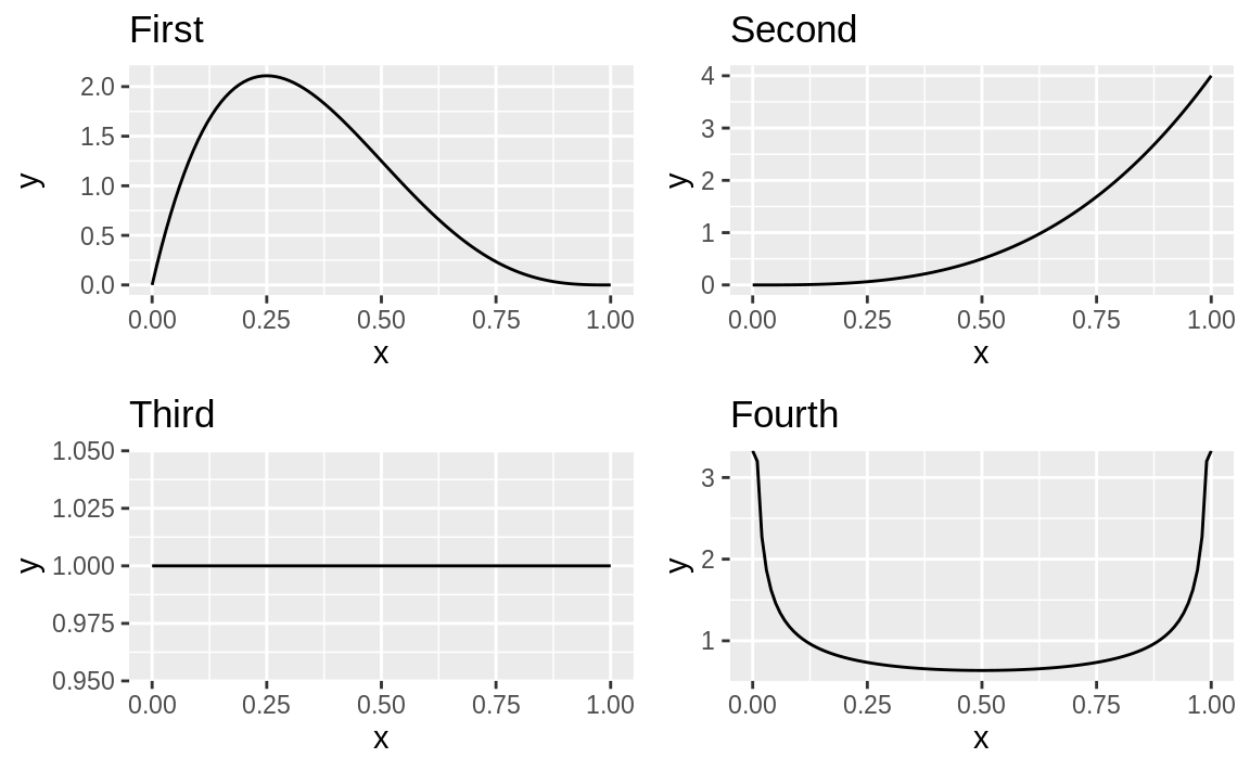
Figure 10.61: Four plots using patchwork
The output is shown in Figure 10.61.
To lay the images out in columns order, we could pass the byrow=FALSE to plot_layout:
See Also
Recipe 8.11, “Plotting a Density Function”, discusses plotting density functions as we do here.
Recipe 10.9, “Creating One Scatter Plot for Each Group”, shows how you can create a matrix of plots using a facet function.
The grid package and the lattice package contain additional tools
for multifigure layouts with Base graphics.
10.26 Writing Your Plot to a File
Problem
You want to save your graphics in a file, such as a PNG, JPEG, or PostScript file.
Solution
With ggplot figures we can use ggsave to save a displayed image to a file. ggsave will make some default assumptions about size and file type for you, allowing you to specify only a filename:
The file type is derived from the extension you use in the filename you pass to ggsave. You can control details of size, file type, and scale by passing parameters to ggsave. See ?ggsave for specific details.
Discussion
In RStudio, a shortcut is to click on Export in the Plots window and then click on “Save as Image,” “Save as PDF,” or “Copy to Clipboard.” The save options will prompt you for a file type
and a filename before writing the file. The “Copy to Clipboard” option can be handy if you are manually copying and pasting your graphics into a presentation or word processor.
Remember that the file will be written to your current working directory
(unless you use an absolute filepath), so be certain you know which
directory is your working directory before calling savePlot.
In a noninteractive script using ggplot, you can pass plot objects directly to ggsave so they need not be displayed before saving. In the prior recipe we created a plot object called g1. We can save it to a file like this:
Note that the units for height and width in ggsave are specified with the units parameter. In this case we used in for inches, but ggsave also supports mm and cm for the more metricly inclined.
See Also
See Recipe 3.1, “Getting and Setting the Working Directory”, for more about the current working directory.